Pop 2
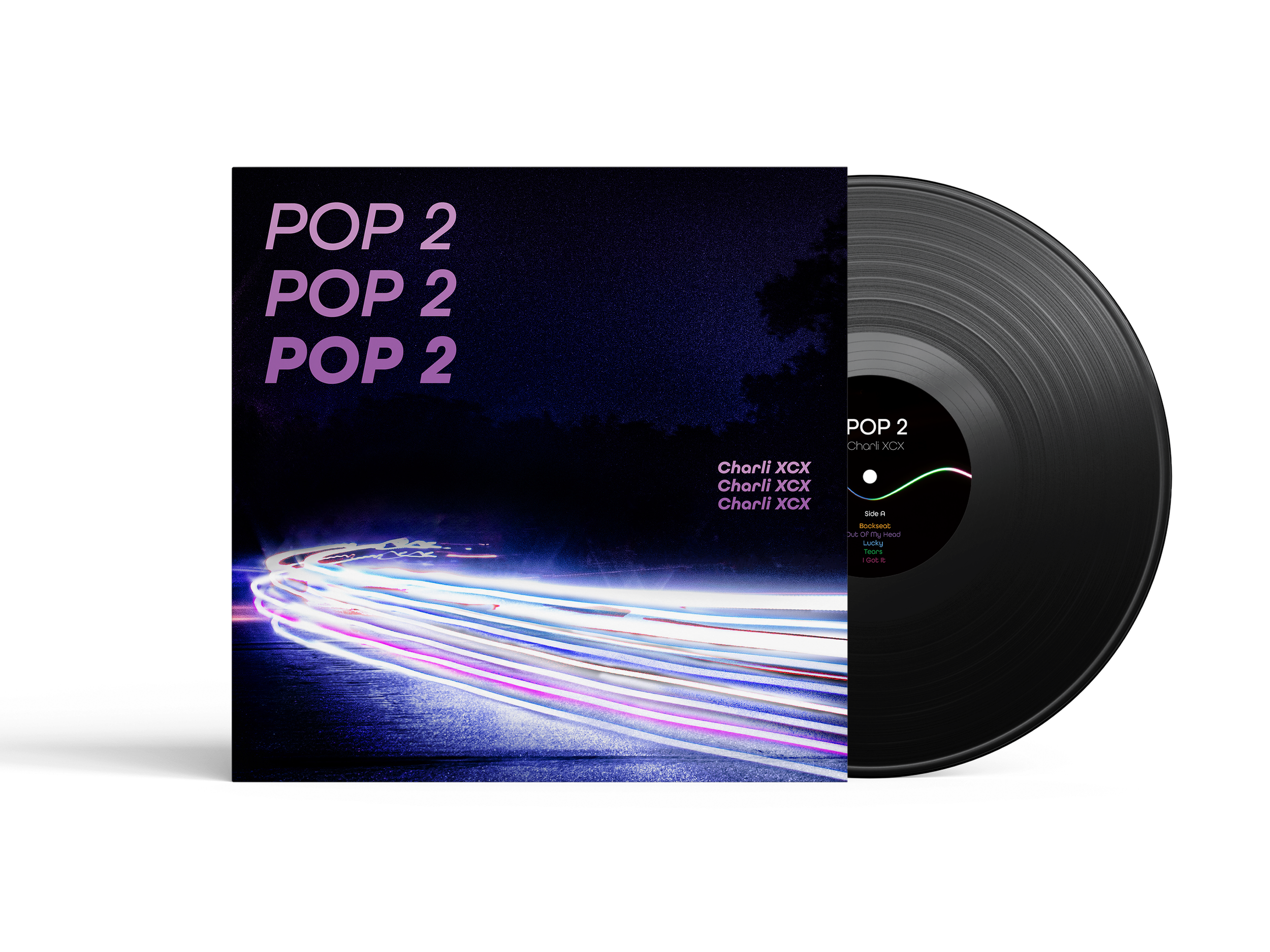
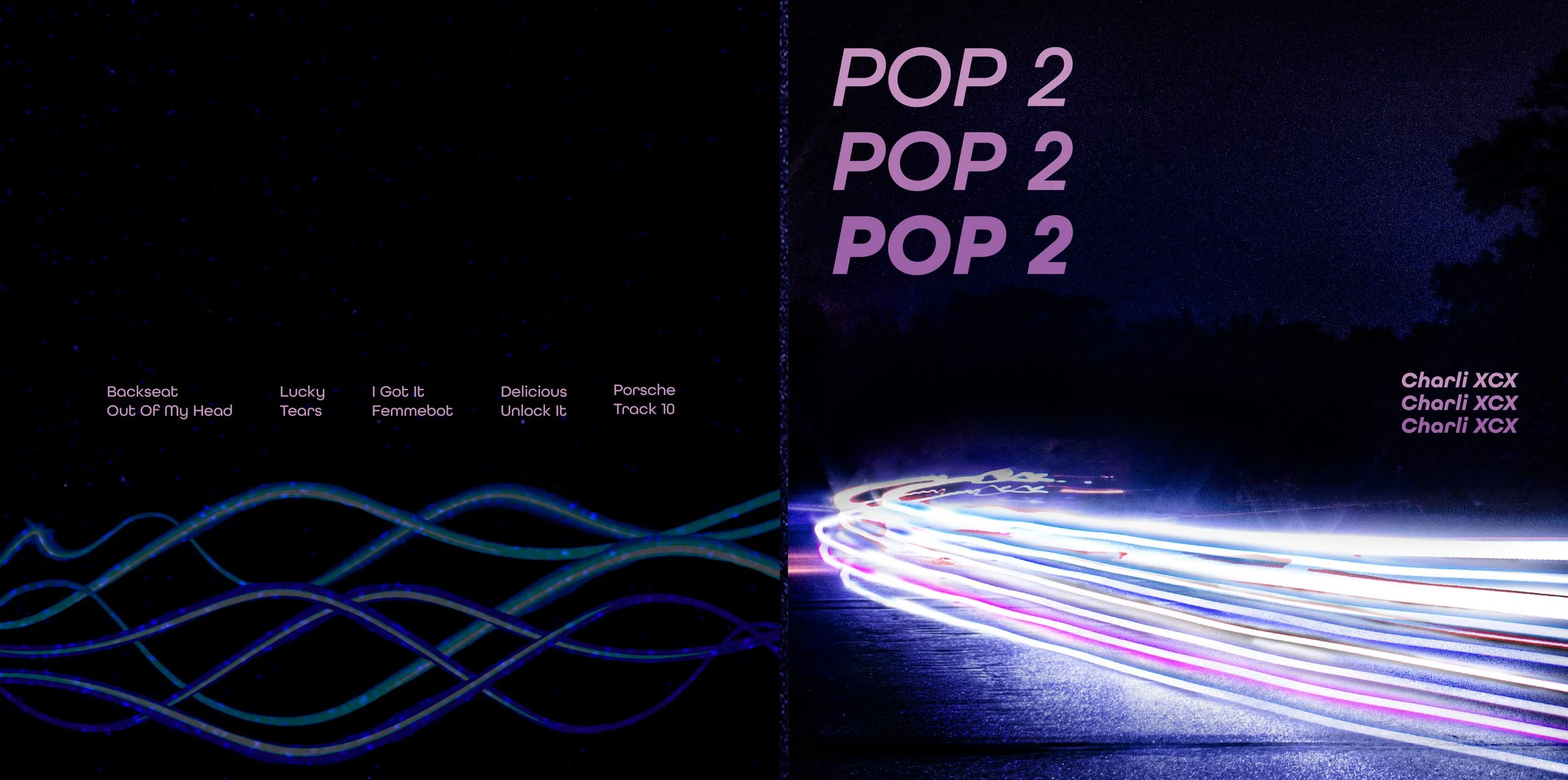
Pop 2 by Charli XCX is an experimental pop album that challenges traditional music through its unpredictable sounds, collaborations, and layered production. For this project, I wanted to translate that energy into a vinyl design that feels bold, chaotic, and visually engaging.
Visual Identity & Packaging Design


Photography
Typography
Photo Editing
Packaging Design
Objective
My goal was to redesign the vinyl packaging for Charli XCX’s Pop 2, creating a visual identity that reflects the album’s experimental sound and energetic personality.
The Challenge
I wanted to capture the chaotic and unpredictable nature of the album without making the design feel overwhelming. The challenge was finding a balance between bold visuals, expressive typography, and a cohesive design that still felt connected to the music.
The Solution & Process
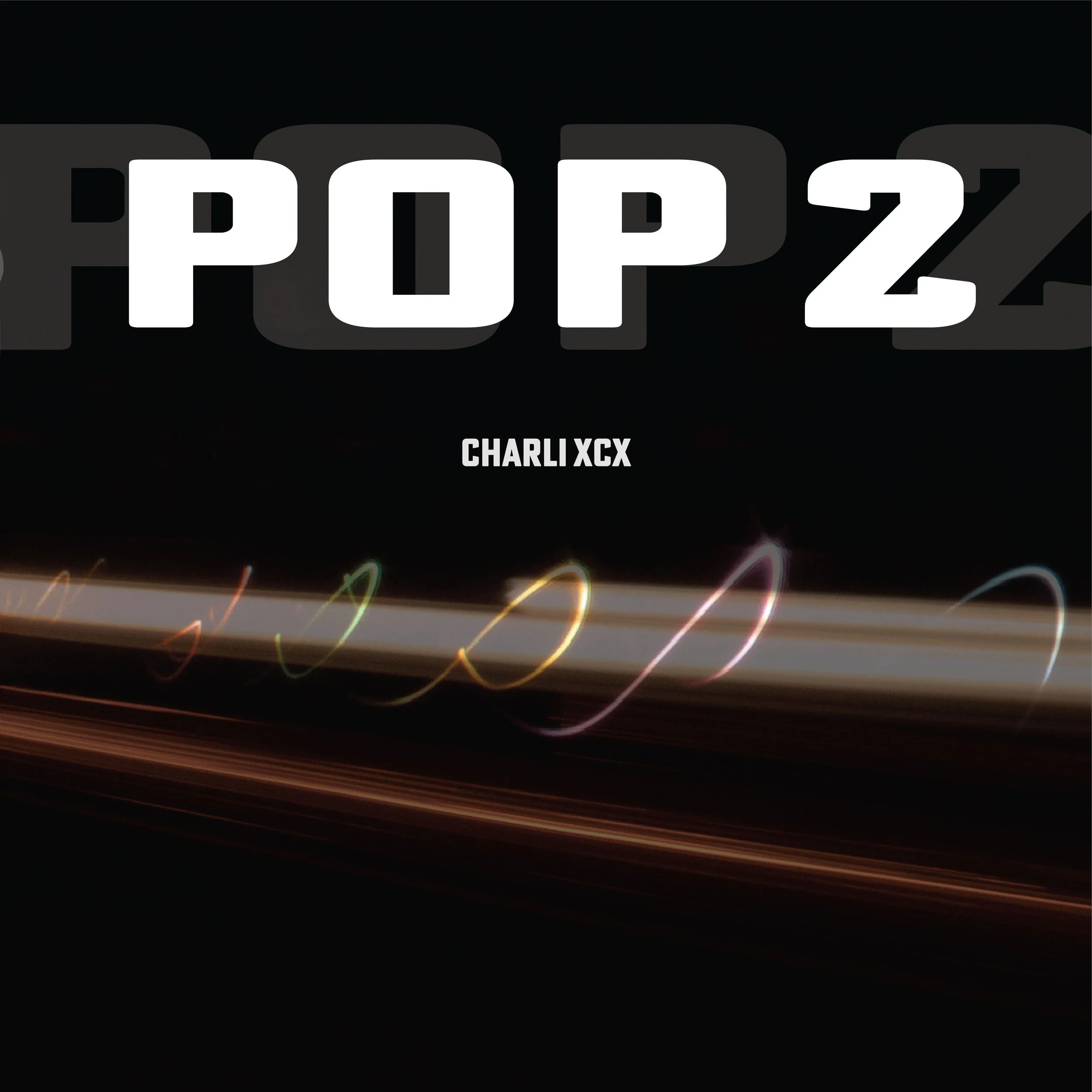
I experimented with long-exposure photography, typography, and color to create a visual system inspired by the album’s layered sound. I used light trails from nighttime photography, edited them into vibrant blues and purples, and explored repetitive typography to bring movement and intensity into the final vinyl design.
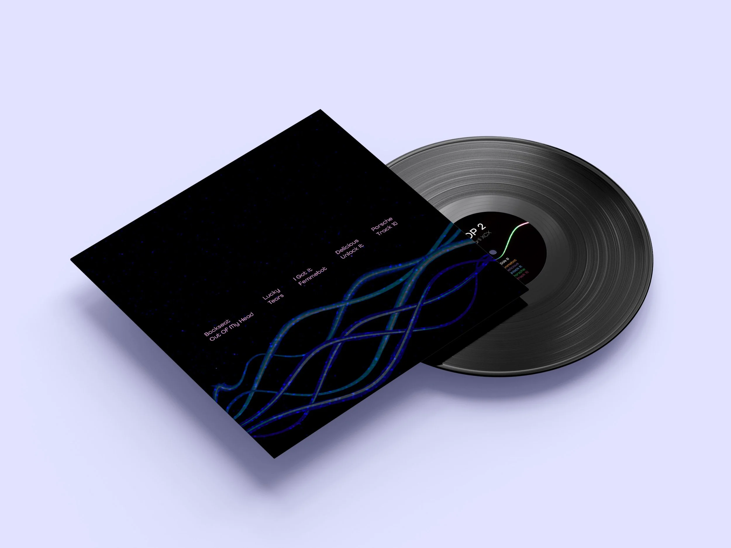
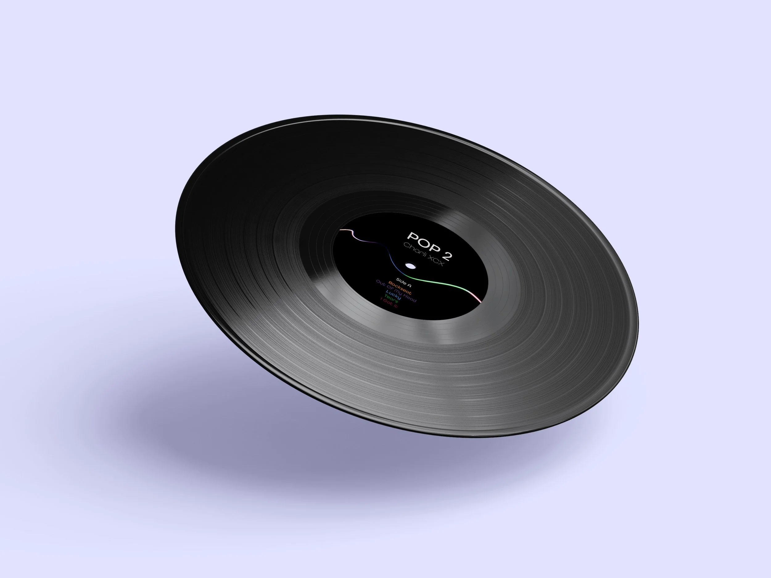
Deliverables: Vinyl Outer Sleeve, Album Artwork, Type System, Physical Print Mockup
Photography
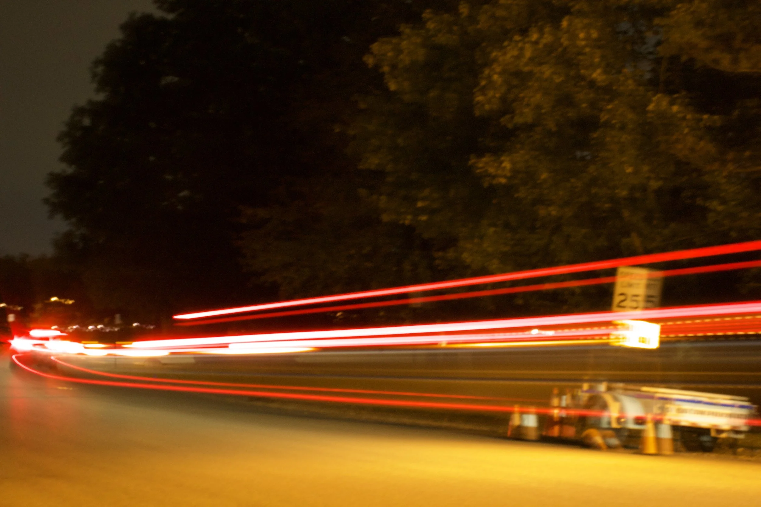
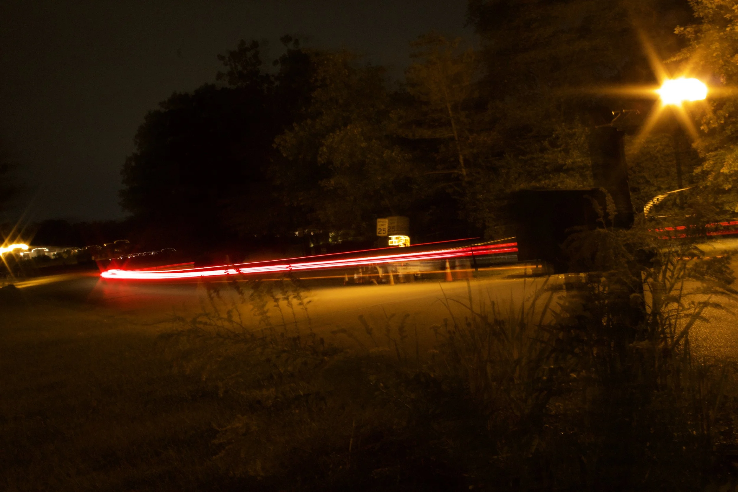
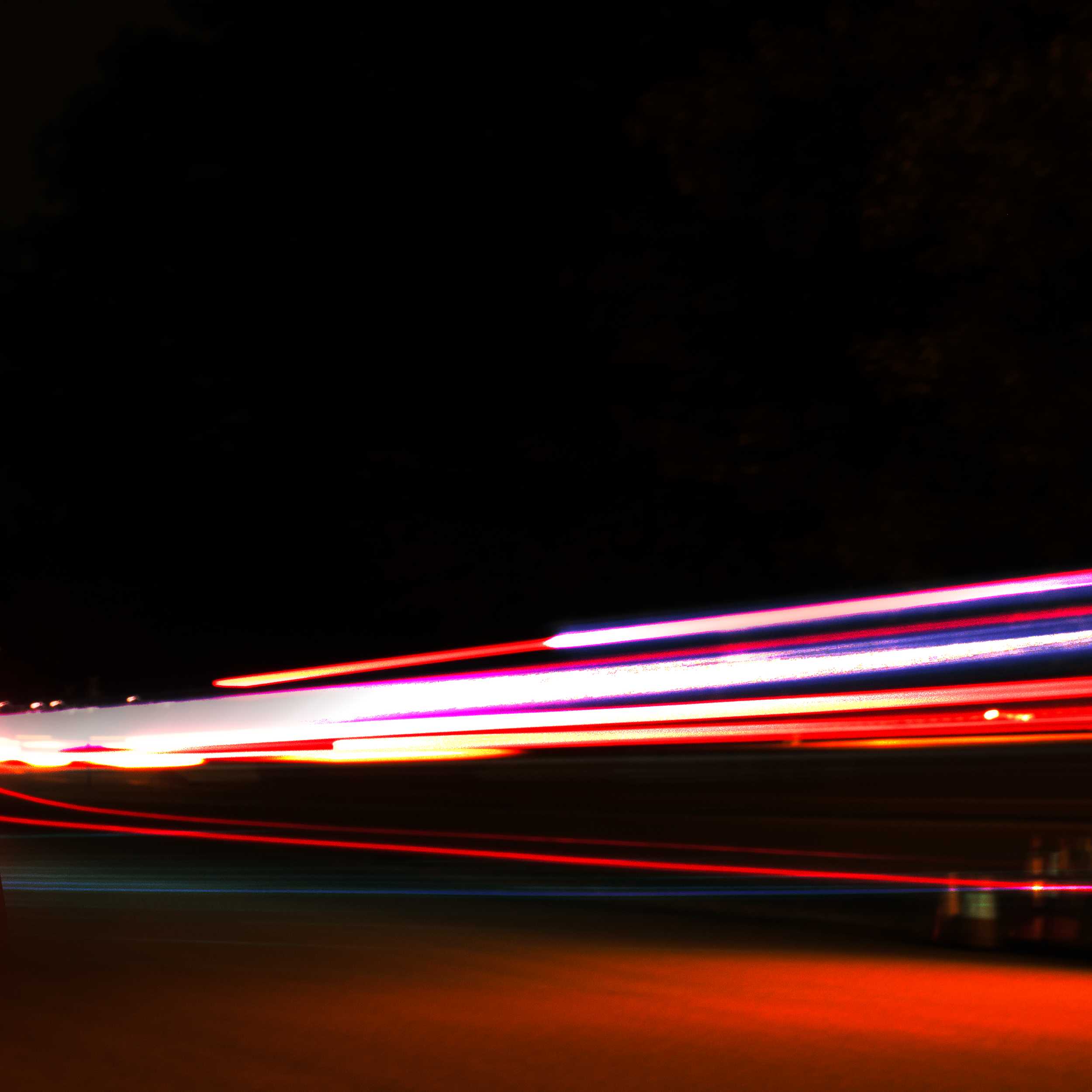
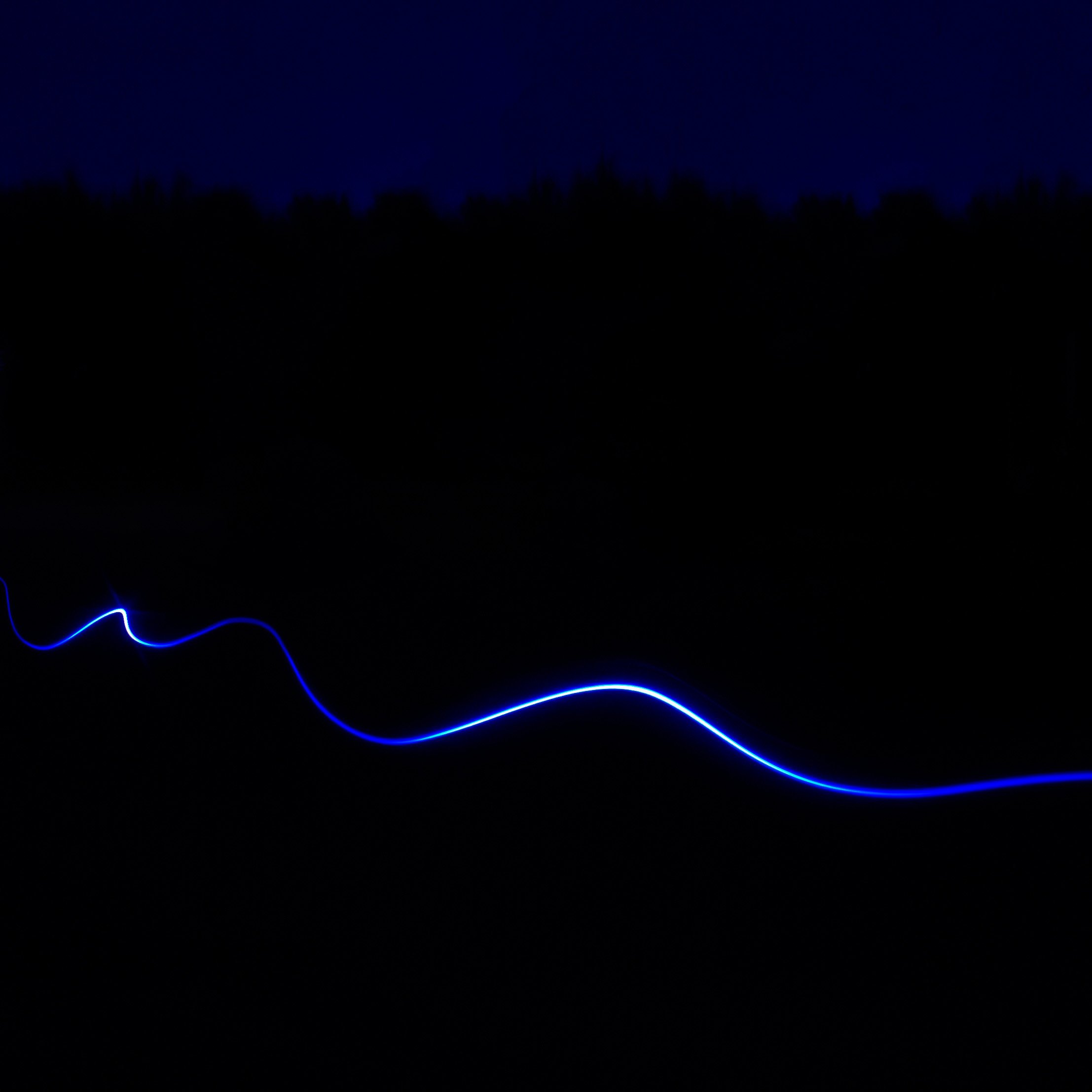
I started by experimenting with long-exposure photography, capturing passing cars at night. I liked how the unpredictable light trails reflected the chaotic and layered sound of the album.
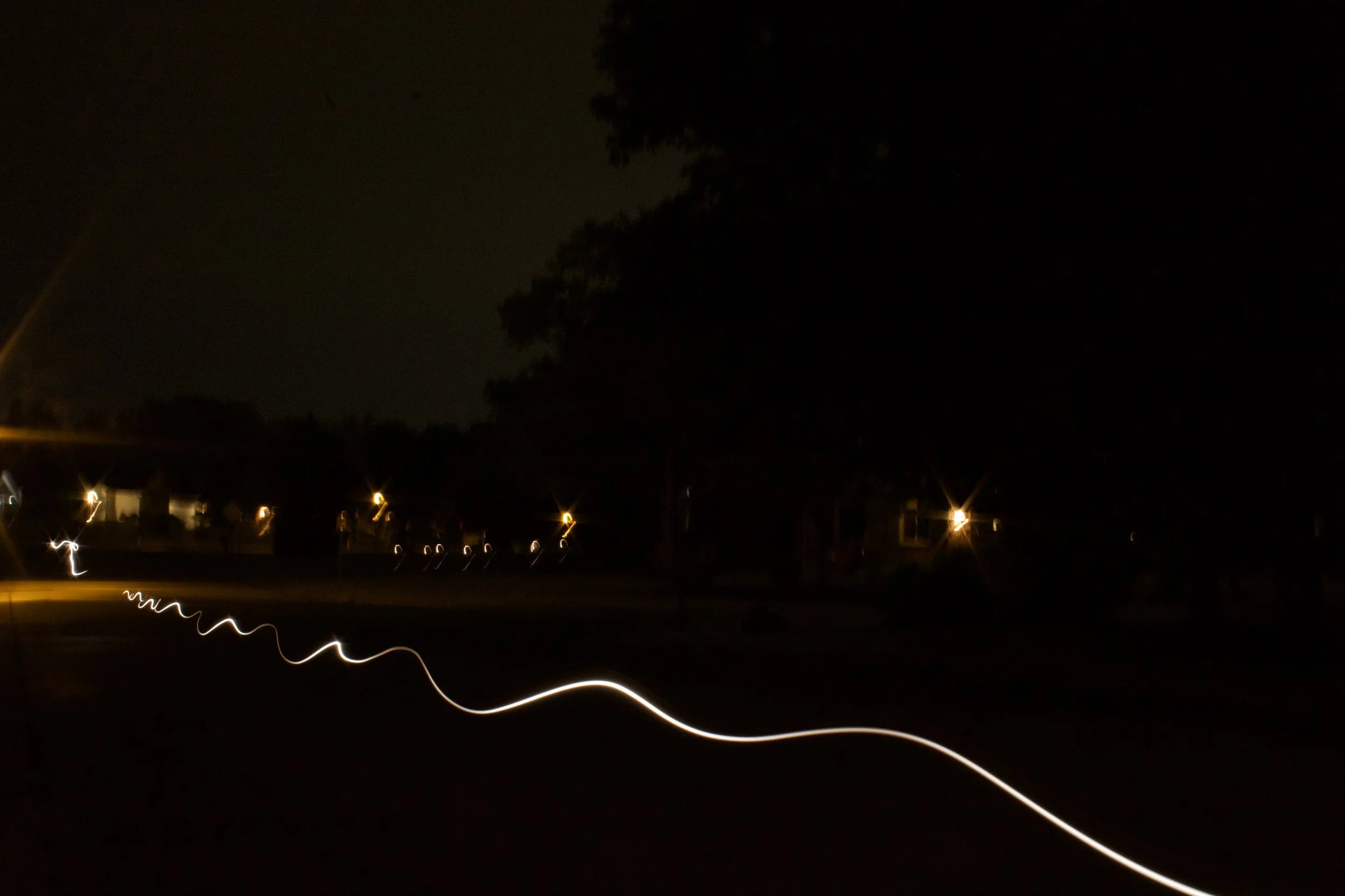
Original
These were my original long-exposure shots. While I liked the movement, I felt they needed more energy to match the album’s sound.
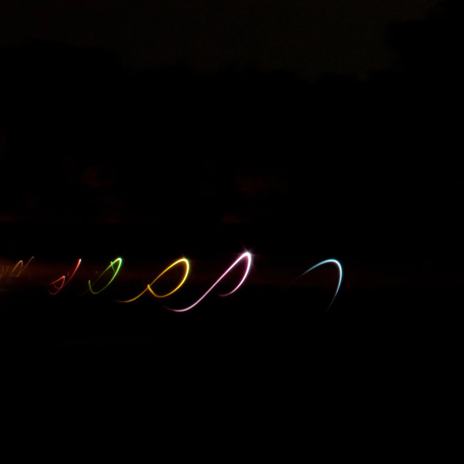
Edited
I brought the images into Photoshop, experimenting with contrast and pushing the colors toward vibrant blues and purples to create a more intense visual.
Design Iterations
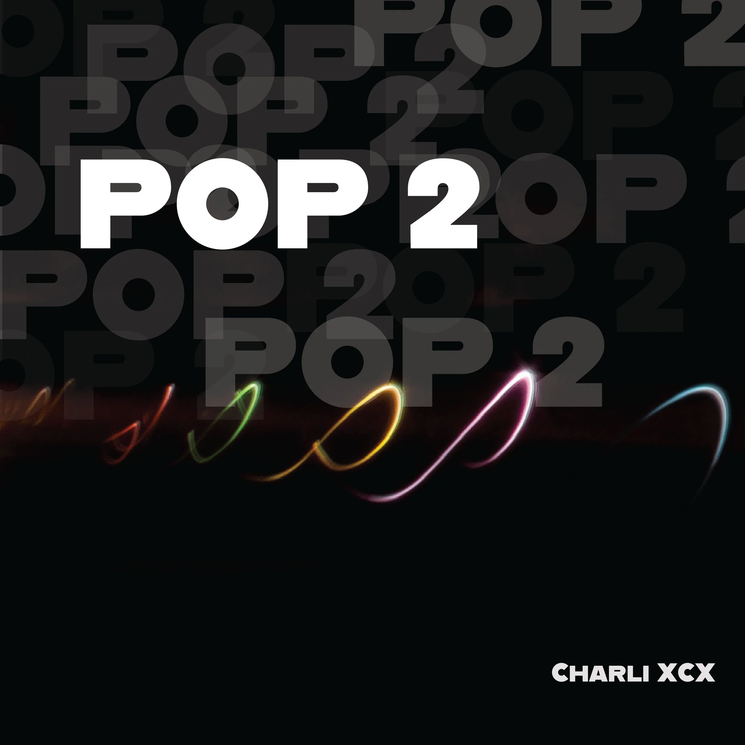
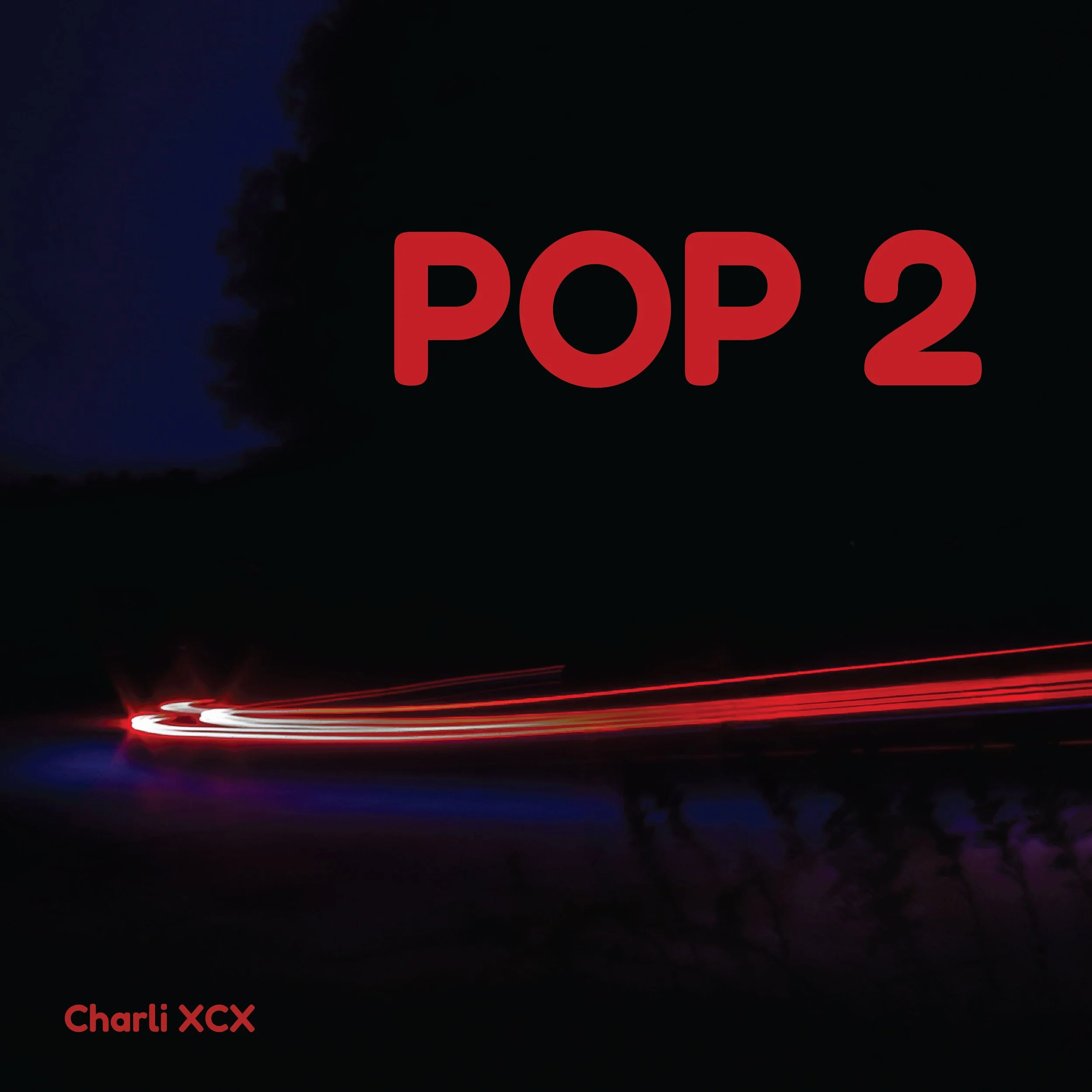
I wanted to experiment with repetition and layering to reflect the album’s unpredictable and experimental sound. I explored different typefaces, colors, and layouts, playing with scale and overlapping text to create a sense of movement. My goal was to make the design feel chaotic and energetic while still maintaining a cohesive visual identity.
Typography & Color
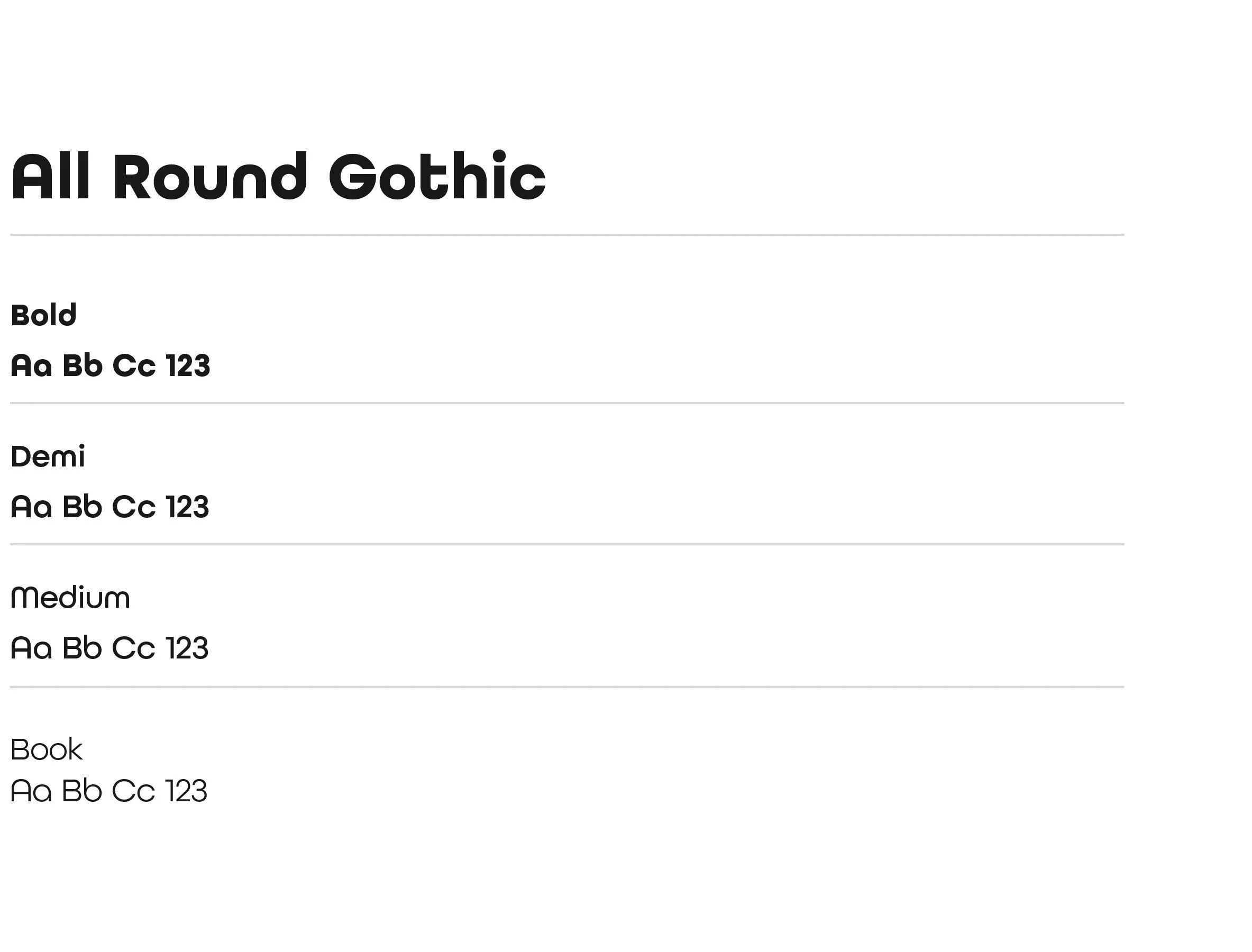
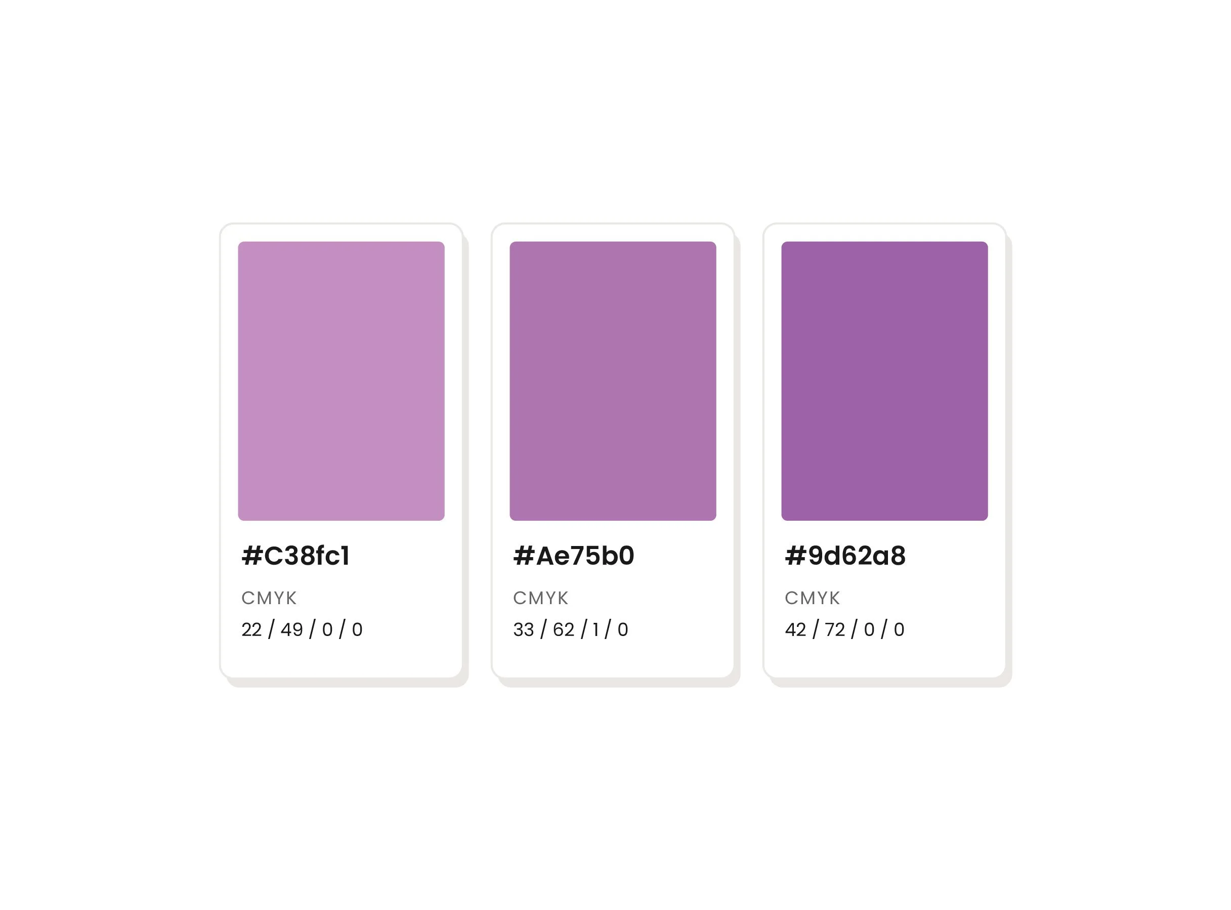
After exploring different typefaces, I chose All Round Gothic for its bold, rounded letterforms and variety of weights. I liked how it felt playful and approachable while still having a strong visual presence. Paired with the electric blues and purples from my photography, the typography helped balance the album’s experimental energy with its pop influences.
Typography
Colors
Final