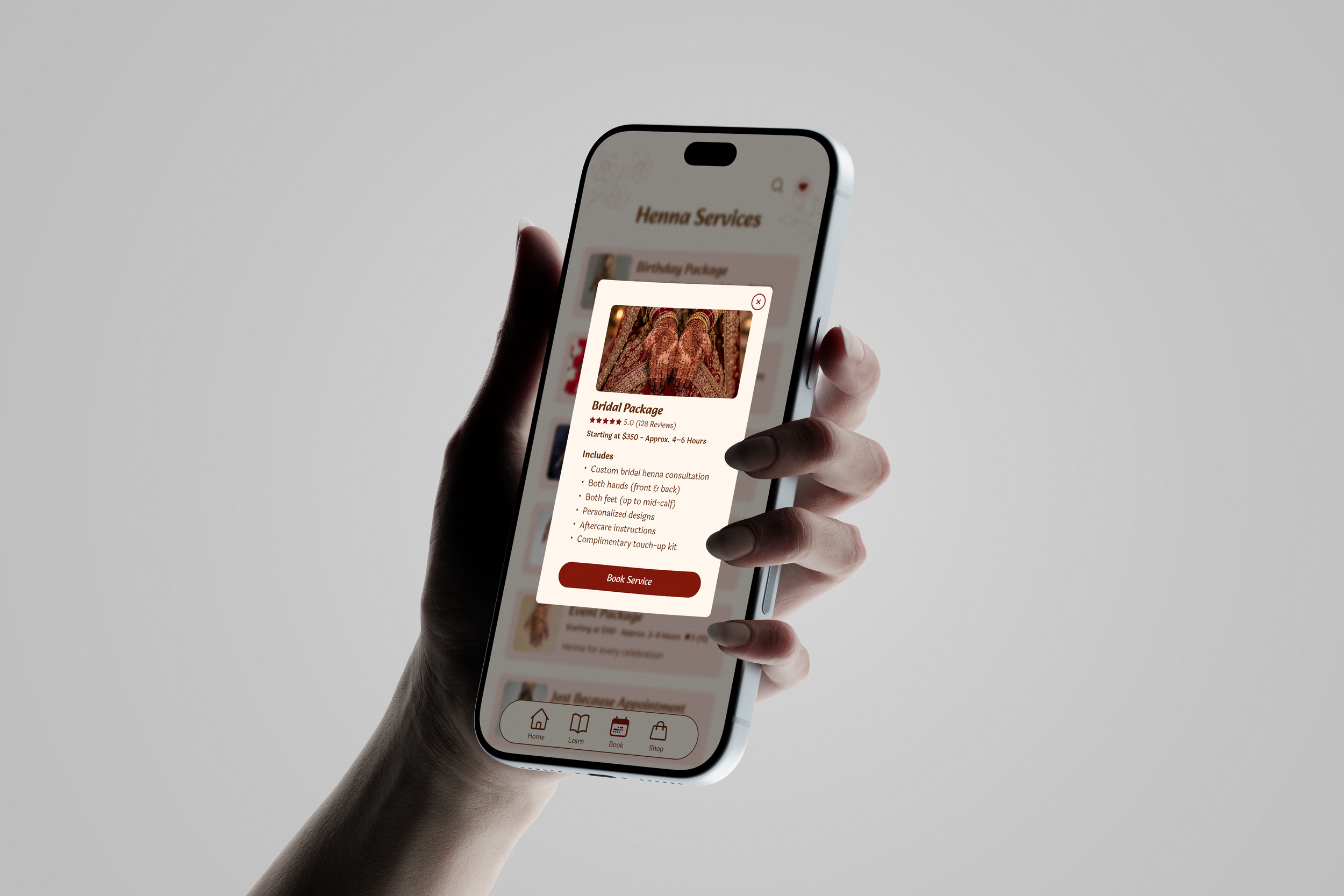
Fatima’s Henna Artistry App
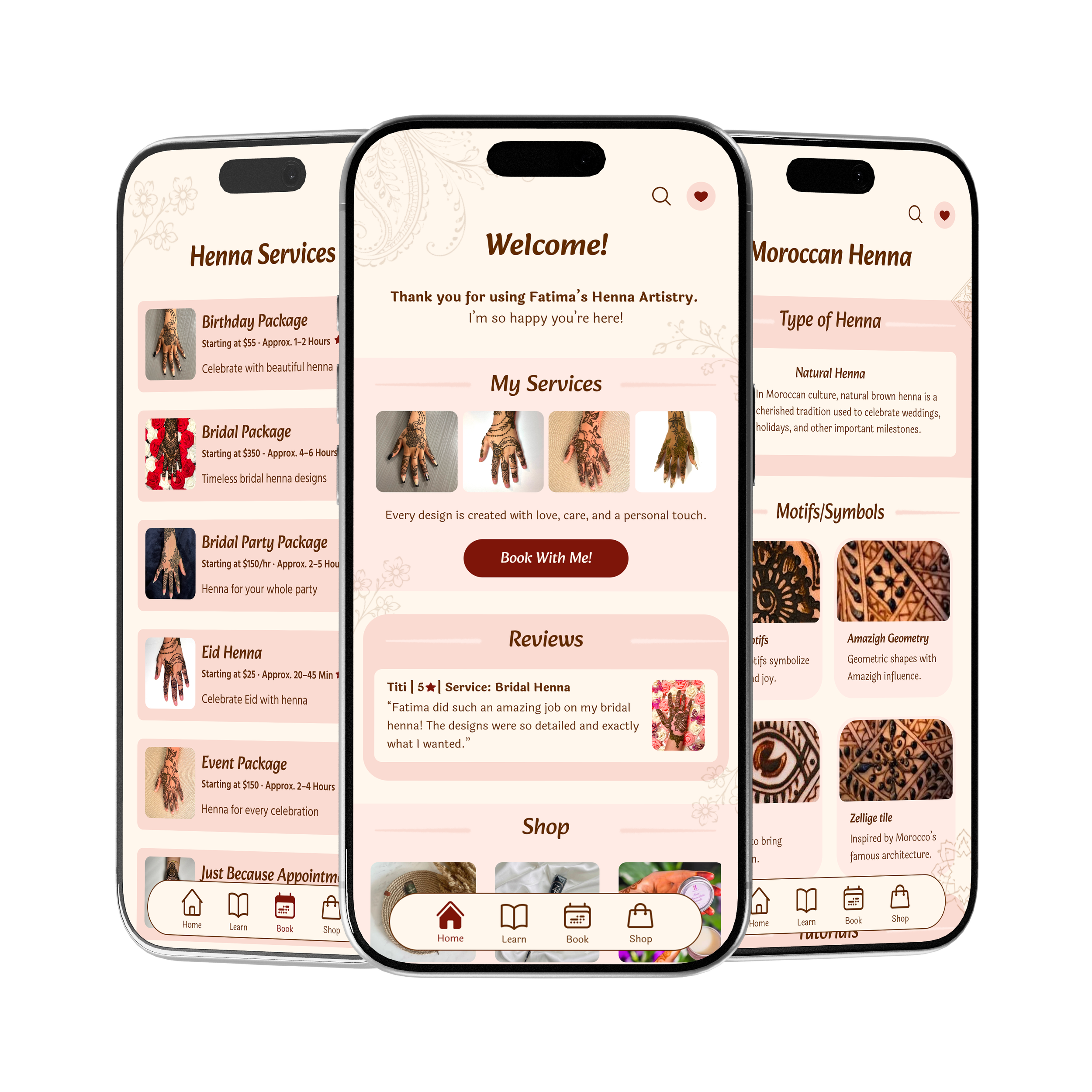
Fatima’s Henna Artistry is a mobile app concept designed to make exploring and booking henna services easier. The app combines appointment booking, shopping, and educational resources into one experience, helping users learn about henna while connecting with the artistry behind it.
UX/UI Design · Mobile App Design
Wireframing
UX Research
Prototyping
UI Design
Objective
My goal was to design a mobile app for Fatima’s Henna Artistry that makes it easier for customers to book appointments, shop for natural henna products, and learn about the cultural significance of henna.
The Challenge
I wanted to bring multiple features together without making the app feel overwhelming. The challenge was creating an intuitive experience that balances booking, shopping, and education while maintaining a cohesive visual identity.
The Solution & Process
I developed user personas, wireframes, and a visual design system to guide the app’s structure and appearance. I focused on creating a welcoming experience through simple navigation, soft colors, and flowing shapes inspired by henna designs.
Deliverables: Mobile App Design, User Personas, Wireframes, UI Design, Interactive Prototype
User Personas & Task Flows
I created two user personas to understand the different needs of customers using the app. From booking bridal henna to exploring designs and learning about henna, these personas helped me think through how users would navigate the app and complete their goals.
User Personas
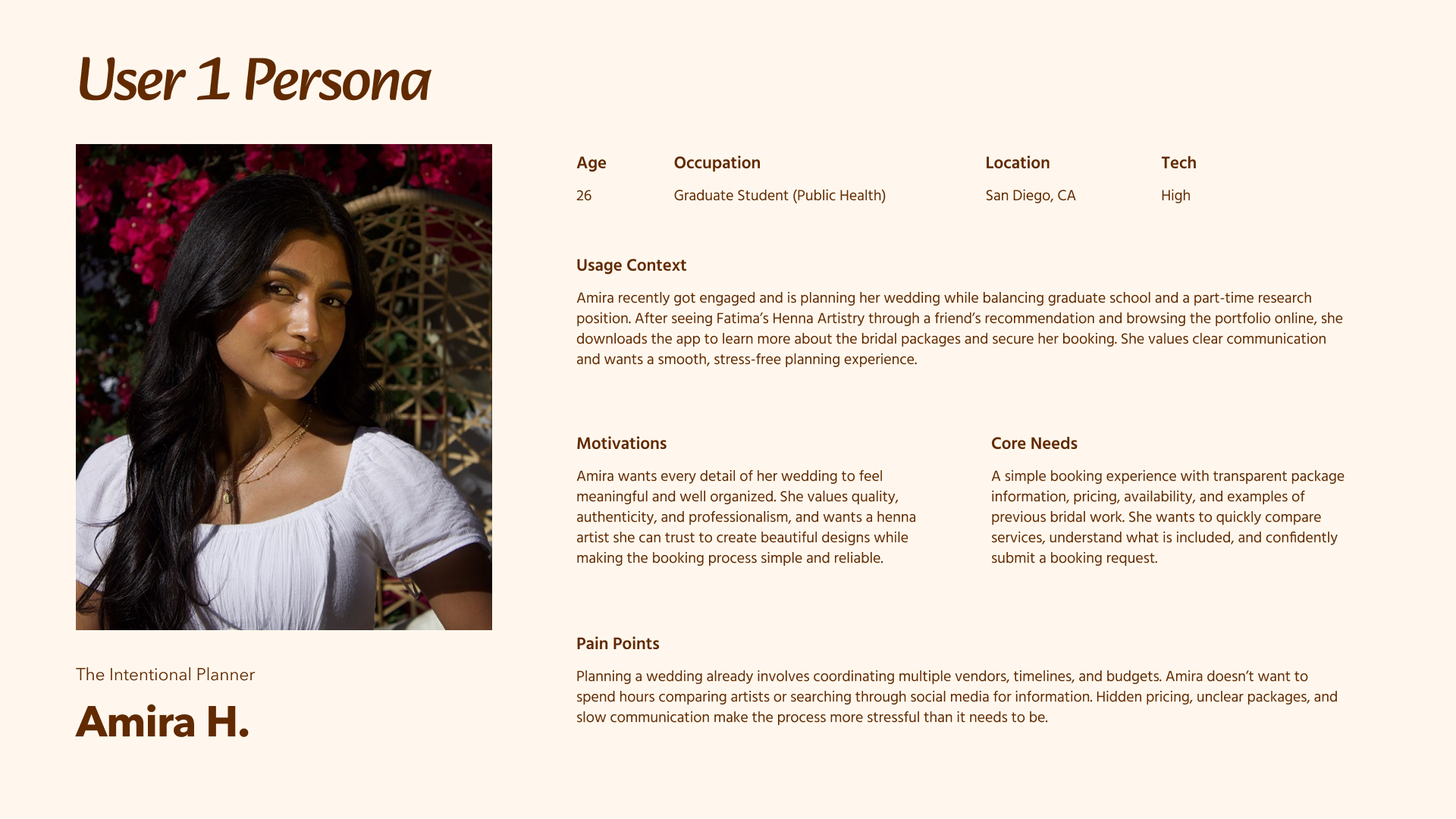
User 1: Amira — The Intentional Planner
Amira is planning her wedding and wants a reliable henna artist who can bring her vision to life. She values clear communication, transparent pricing, and an easy booking experience.
Task Flows
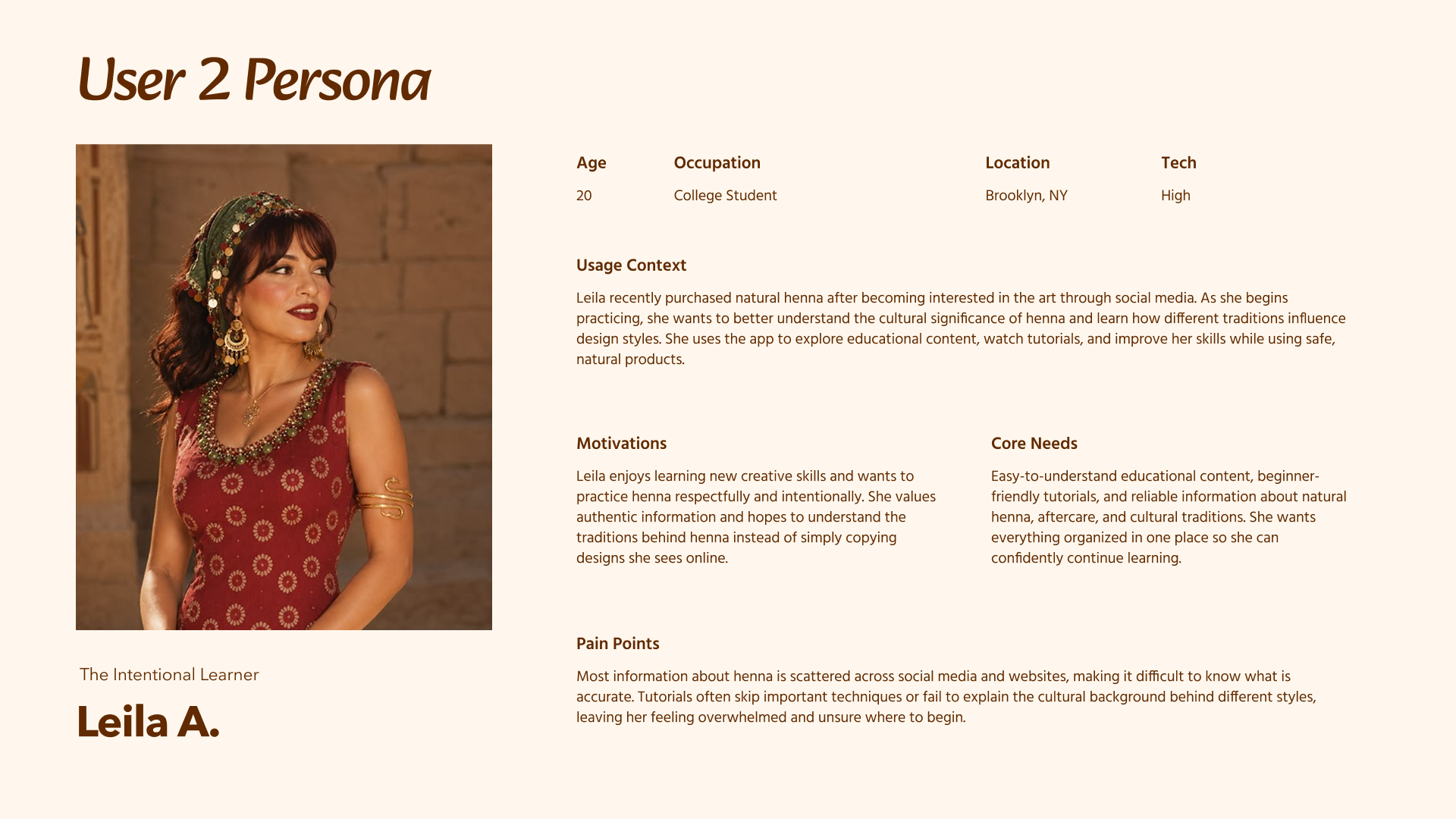
User 2: Leila — The Intentional Learner
Leila is interested in learning more about natural henna and its cultural traditions. She wants trustworthy educational resources, tutorials, and inspiration to help develop her skills.
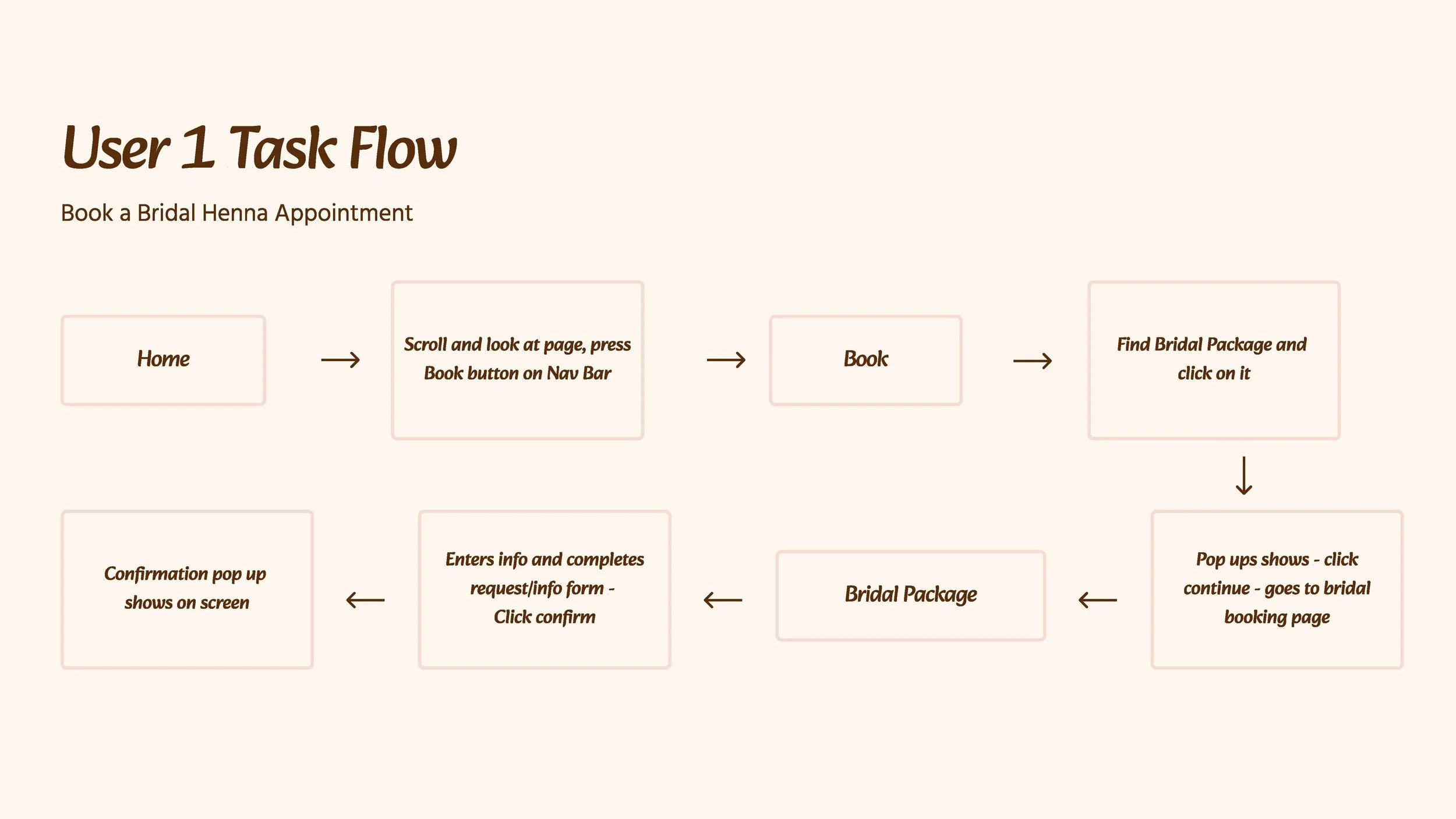
User 1: Booking a Bridal Henna Appointment
This flow explores how Amira navigates the app to find a bridal package, review her options, and complete her booking.
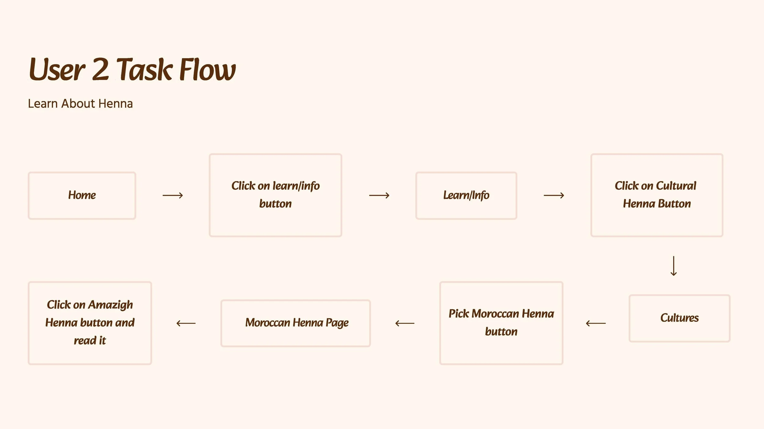
User 2: Learning About Henna
This flow follows Leila as she explores the Learning Hub to discover different cultural henna traditions and designs.
Wireframing & Prototyping
Sketches
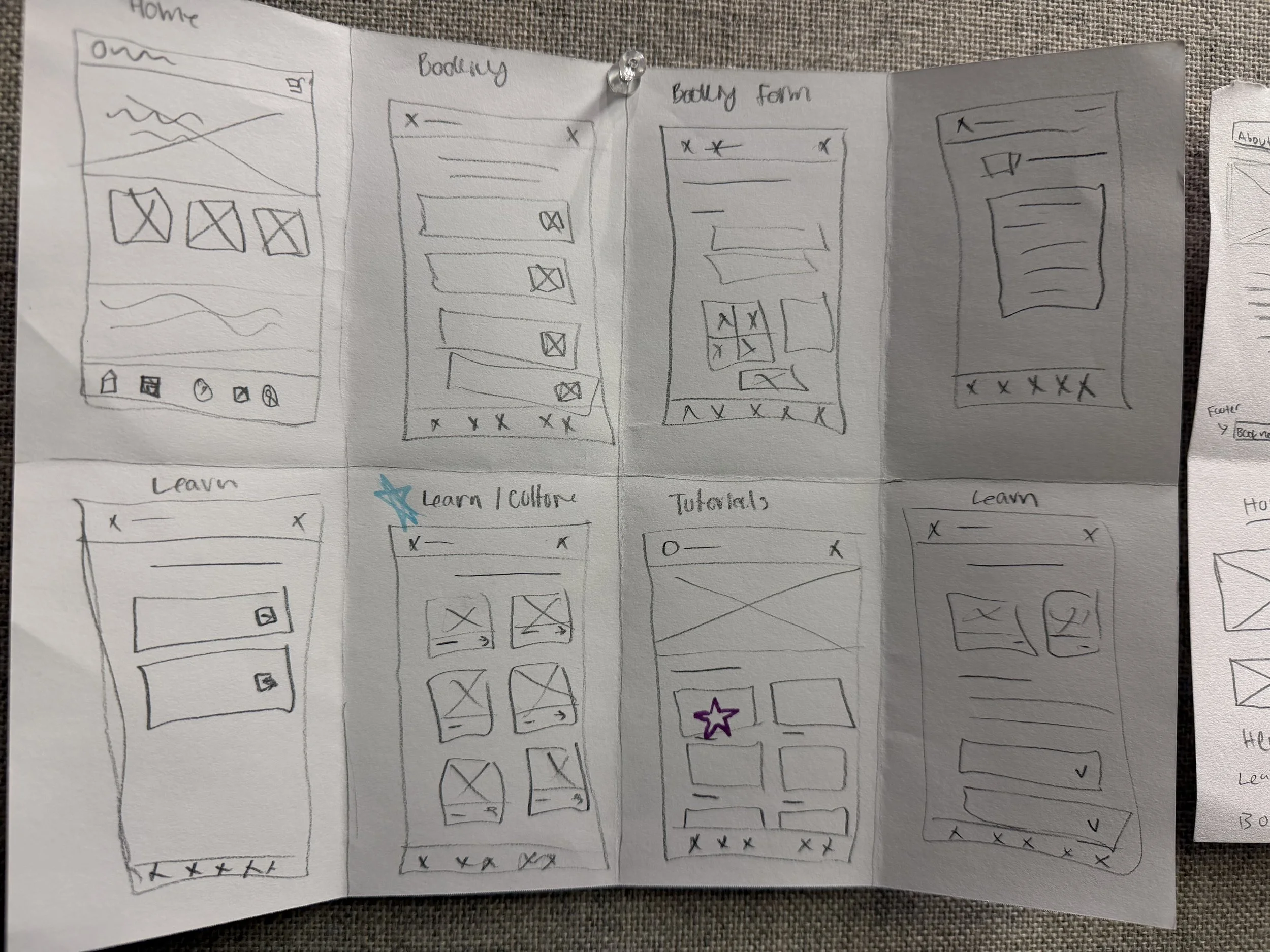
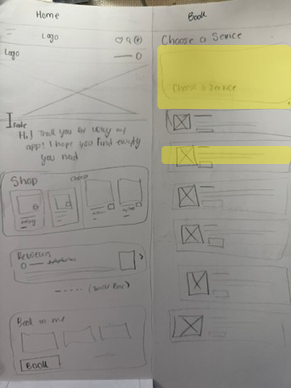
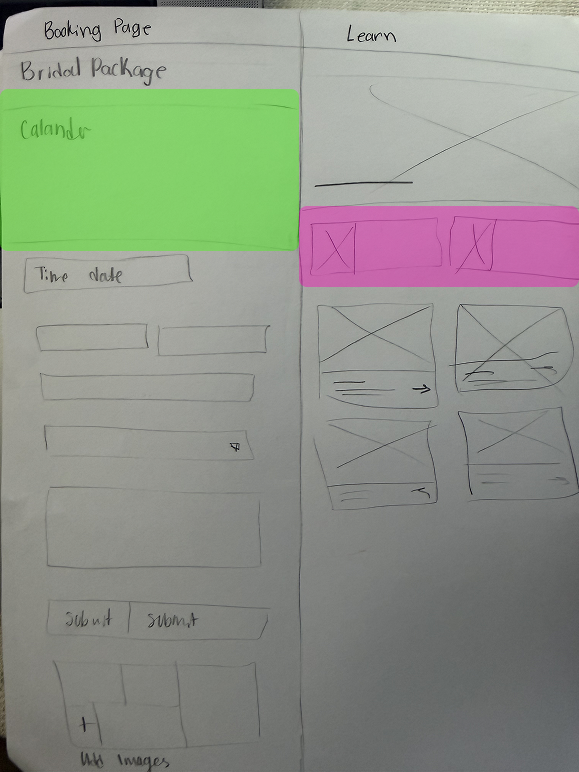
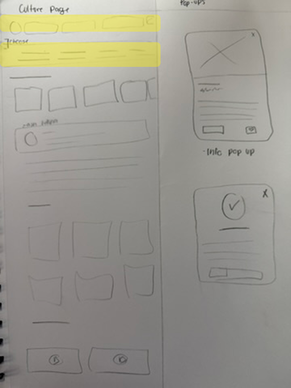
I started with Crazy 8 sketches to explore different layouts, navigation, and ways to organize the app’s content. I struggled with balancing imagery and information, so I used feedback to simplify the layouts and create a clearer visual hierarchy.
I started by exploring different layouts and organizing the app’s five main pages: Home, Booking, Learning Hub, Shop, and Profile. From there, I developed wireframes in Figma, focusing on making the app easy to navigate while bringing its different features together.
Wireframe Refinement
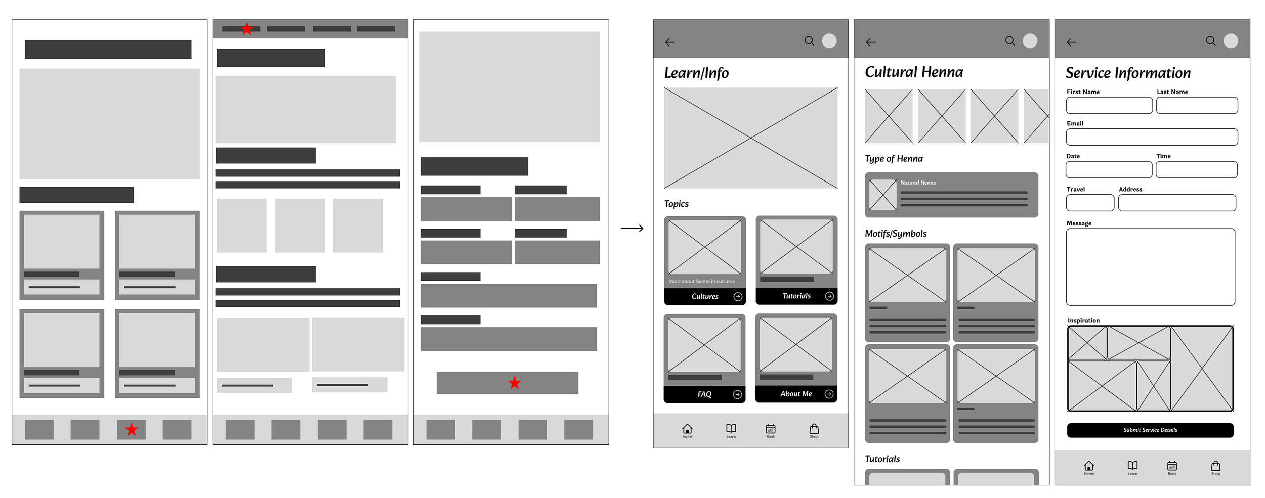
After developing my initial wireframes, I used feedback to refine the layouts and improve how information was organized. I focused on simplifying navigation, reducing unnecessary elements, and finding a better balance between imagery and content.
Static Mockups
Once I established the wireframes, I started experimenting with color, typography, and imagery to bring the app to life. Finding the right color palette was challenging because I wanted the design to feel vibrant without overwhelming the content. Through several iterations, I realized that some colors competed with the images and made the interface feel too busy, so I focused on creating a more balanced visual hierarchy.
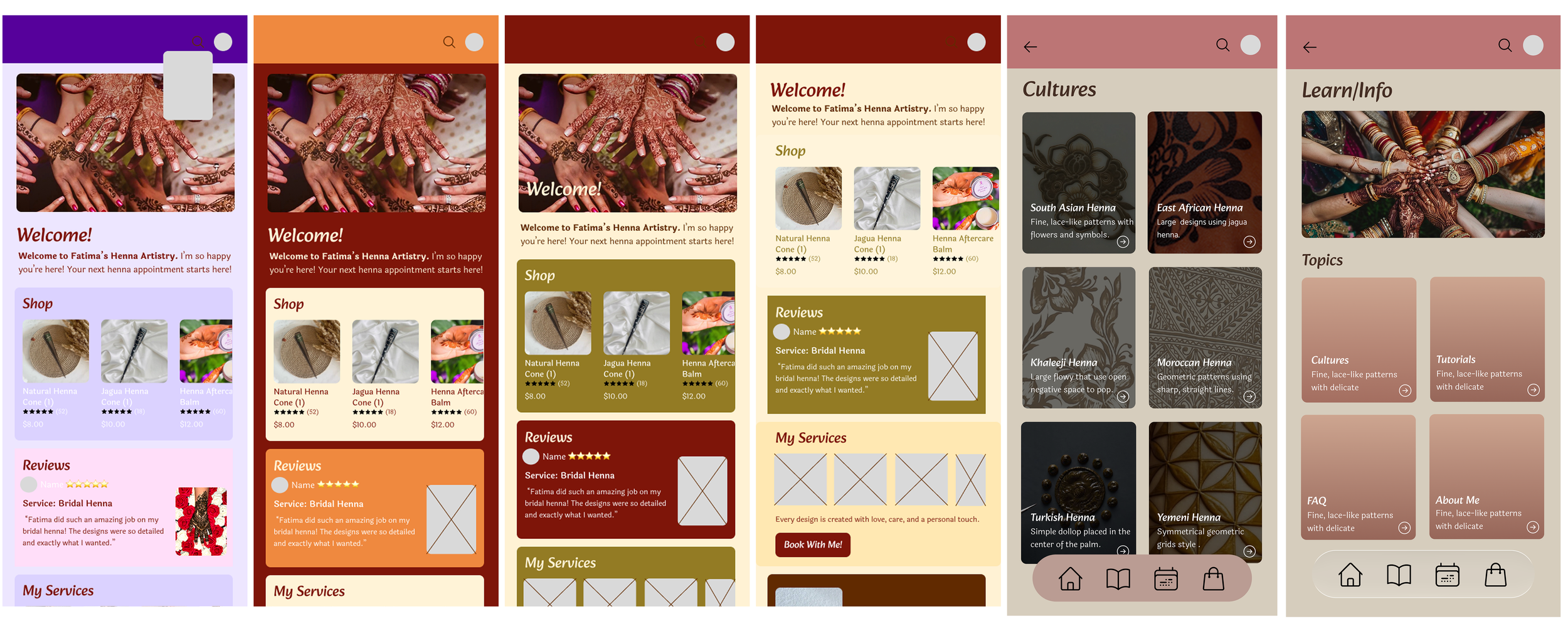
Visual Exploration
I wanted to draw inspiration from henna's natural, earthy qualities while creating a visual identity that felt welcoming and engaging. One of my biggest challenges was balancing the colors. While my initial palettes looked good together, I realized that they lacked hierarchy when applied to the actual interface. The colors were all competing for attention, making it difficult to highlight important information. Through different style tile explorations, I worked toward a more balanced palette where accent colors could stand out without overwhelming the rest of the design.
Exploration
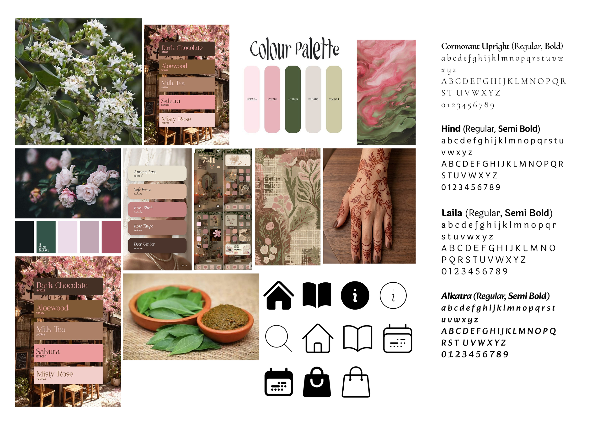
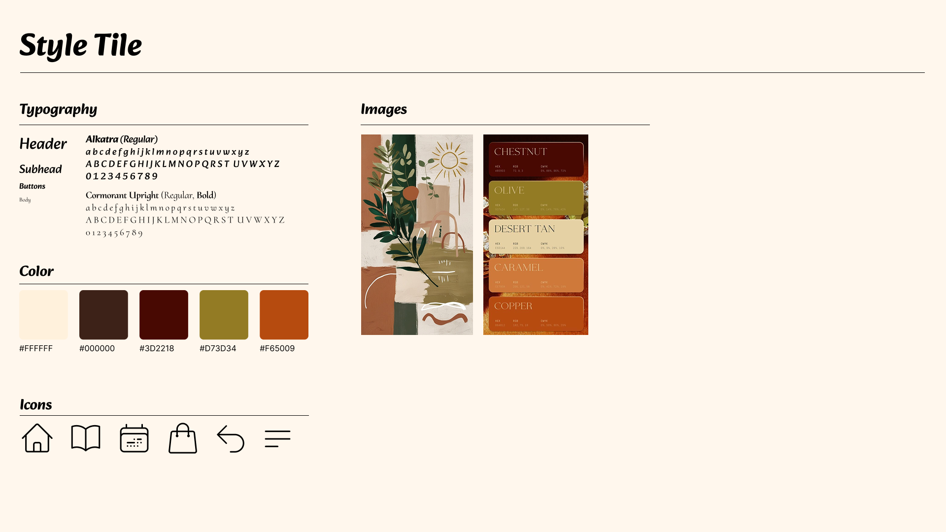
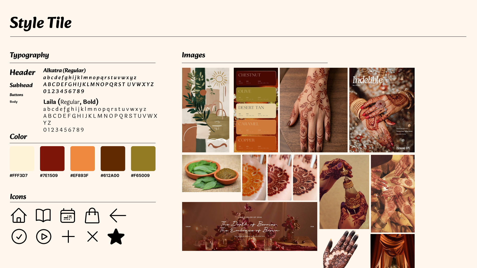
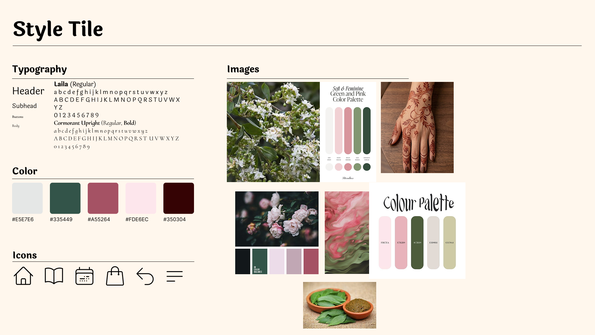
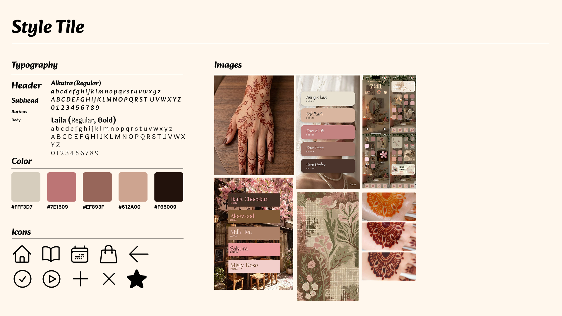
Branding & Design System
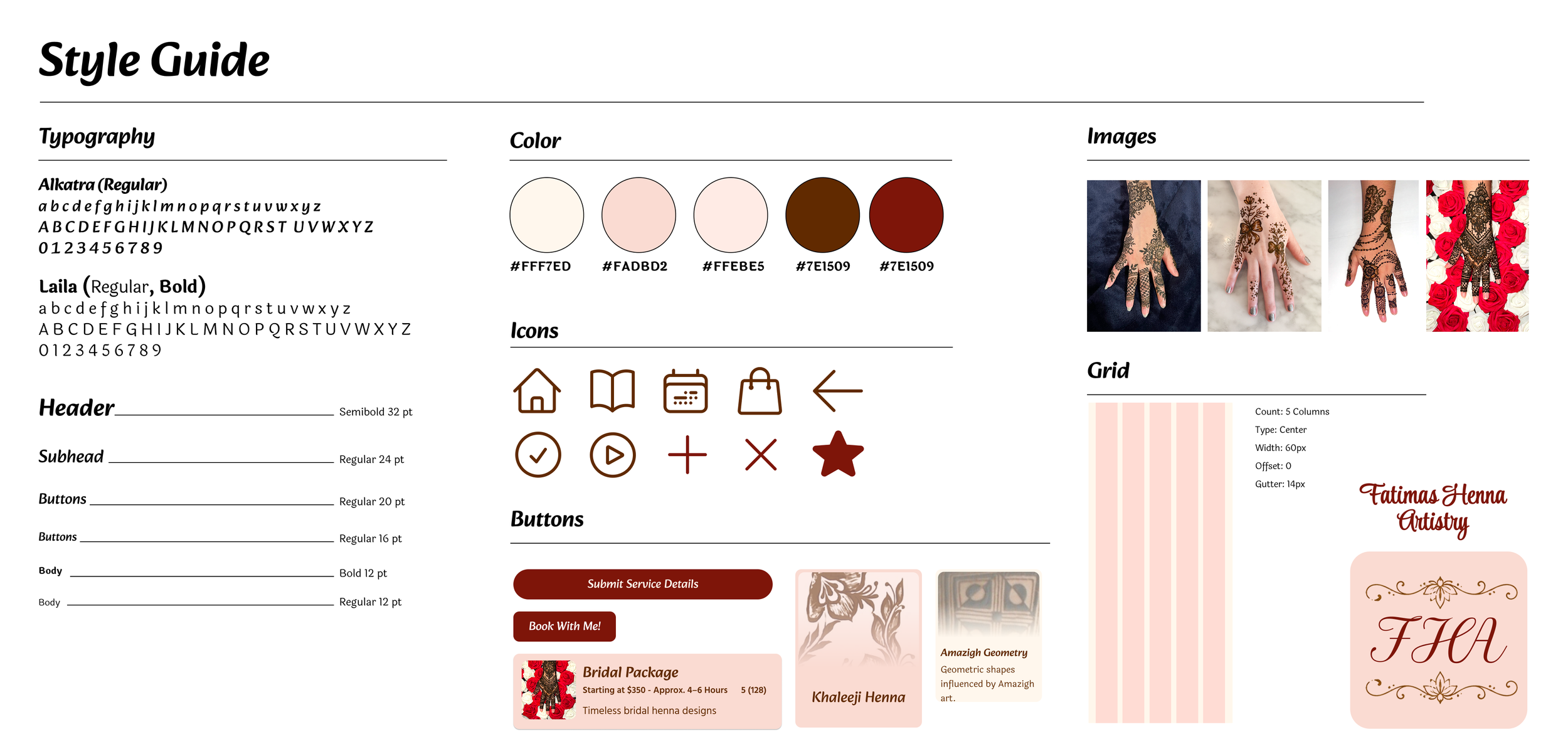
After experimenting with different visual directions, I finalized a design system that captured the natural qualities of henna while maintaining a clean and cohesive interface. I focused on using softer, neutral backgrounds to give the content room to breathe, with stronger accent colors to highlight important elements and actions. I also refined the typography and visual elements to create consistency across the app’s five main pages.
Exploration
Final Design