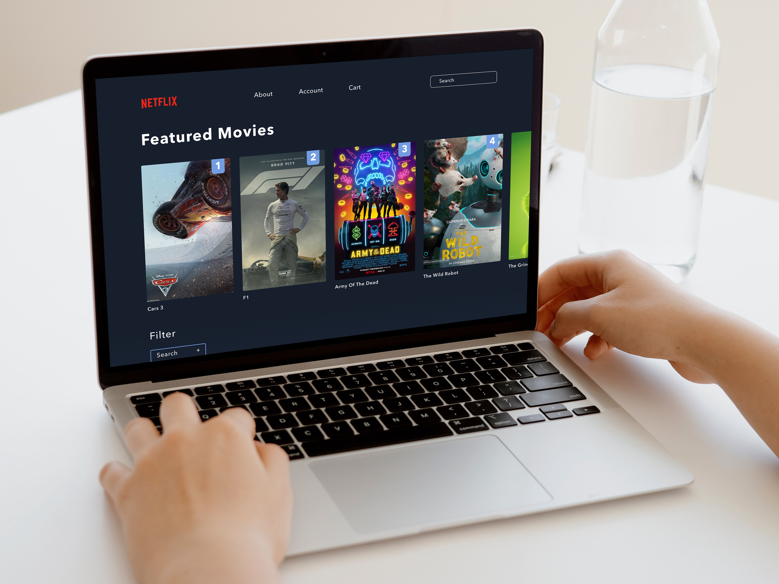
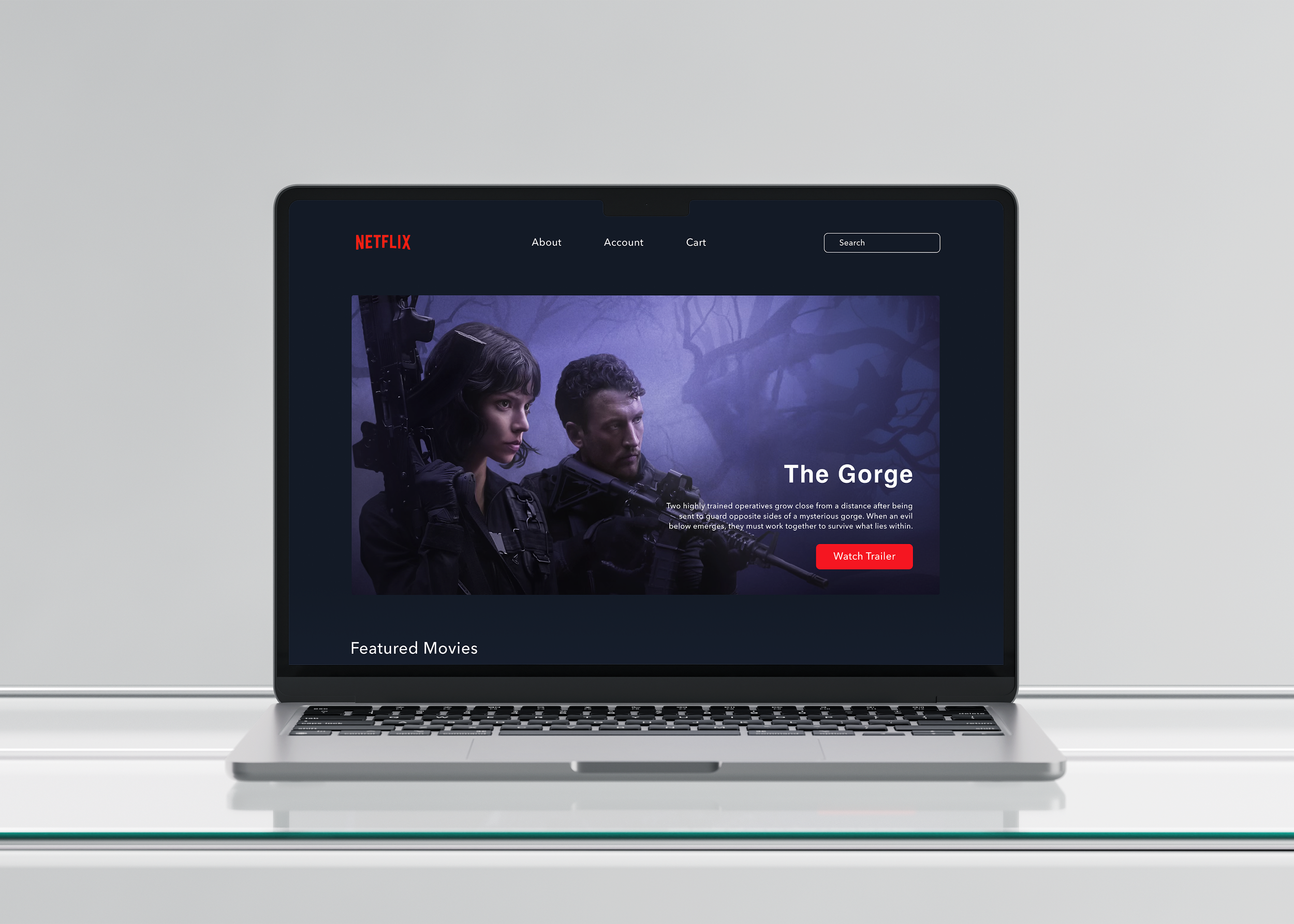
Netflix 2007 Redesign
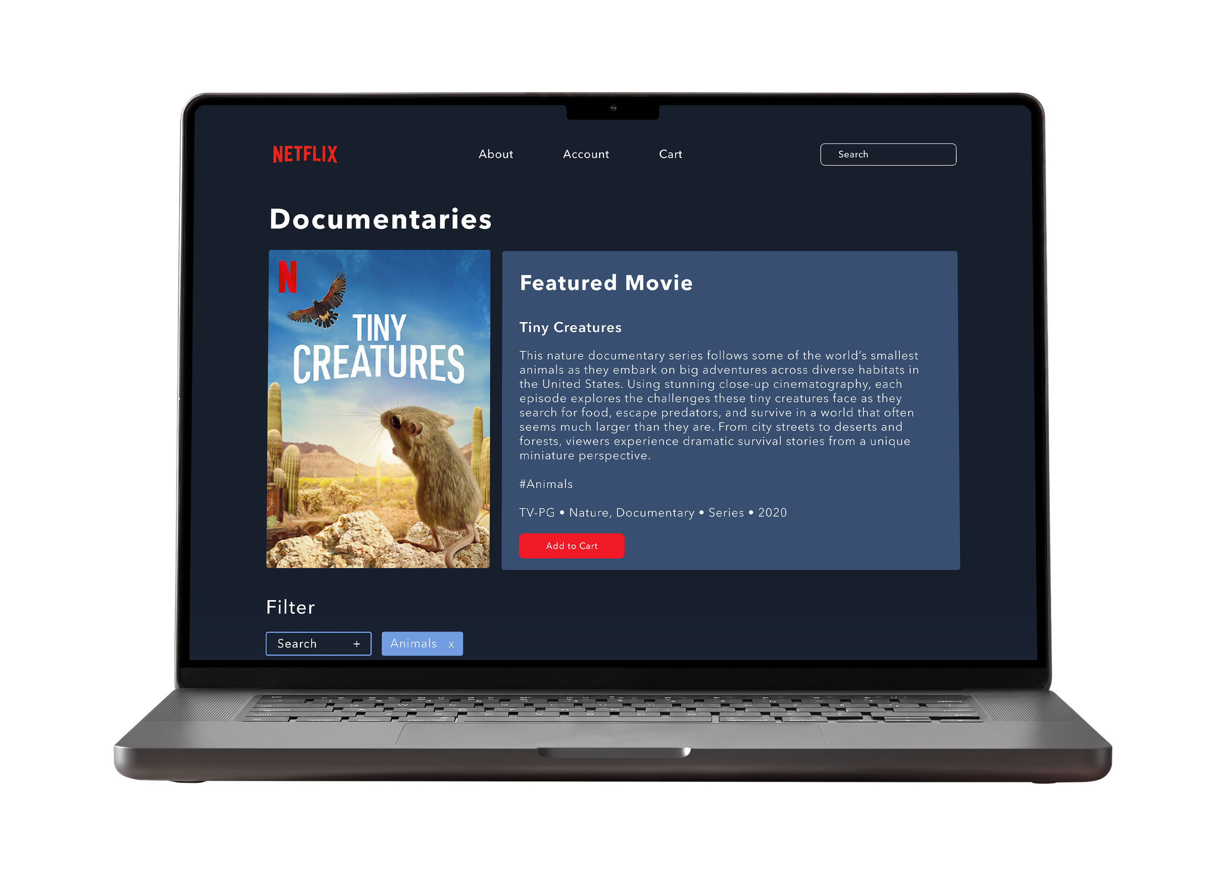
For this collaborative UX/UI project, we redesigned Netflix’s 2007 website to improve navigation, usability, and visual consistency while preserving its original DVD-rental experience.
UX/UI Design & Website Redesign - Group Project
Wireframing
UX Research
UI Design
Prototyping
Objective
Our goal was to redesign Netflix’s 2007 website to improve navigation, information hierarchy, and visual consistency while preserving its original DVD-rental experience.
The Challenge
The original website struggled with cluttered layouts, inconsistent navigation, and unclear visual hierarchy. We needed to make browsing and ordering movies easier without turning Netflix into the streaming platform it is today.
The Solution & Process
We analyzed the original website, conducted competitive benchmarking, and developed user personas, task flows, and wireframes. Through testing and iterations, we refined the browsing experience, improved navigation, and developed a cohesive visual system.
Deliverables: Redesigned Netflix DVD-Rental Website, Interactive Prototype
Initial Analysis
Before redesigning the website, we analyzed Netflix’s original 2007 interface to understand where users might struggle. We identified three main issues: cluttered layouts, inconsistent navigation, and a lack of clear visual hierarchy.
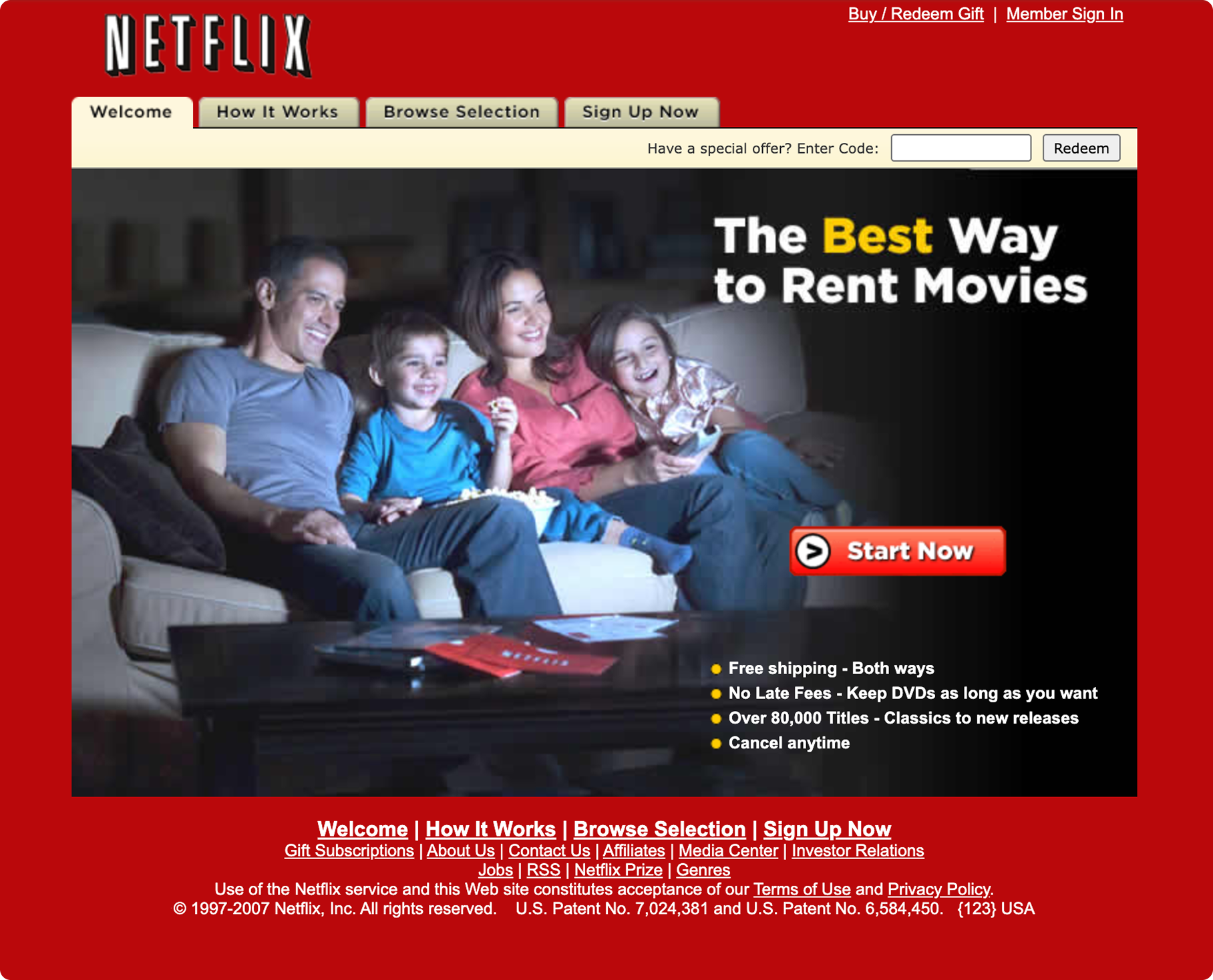
01 - Navigation
Important actions were difficult to locate, and navigation changed between pages.
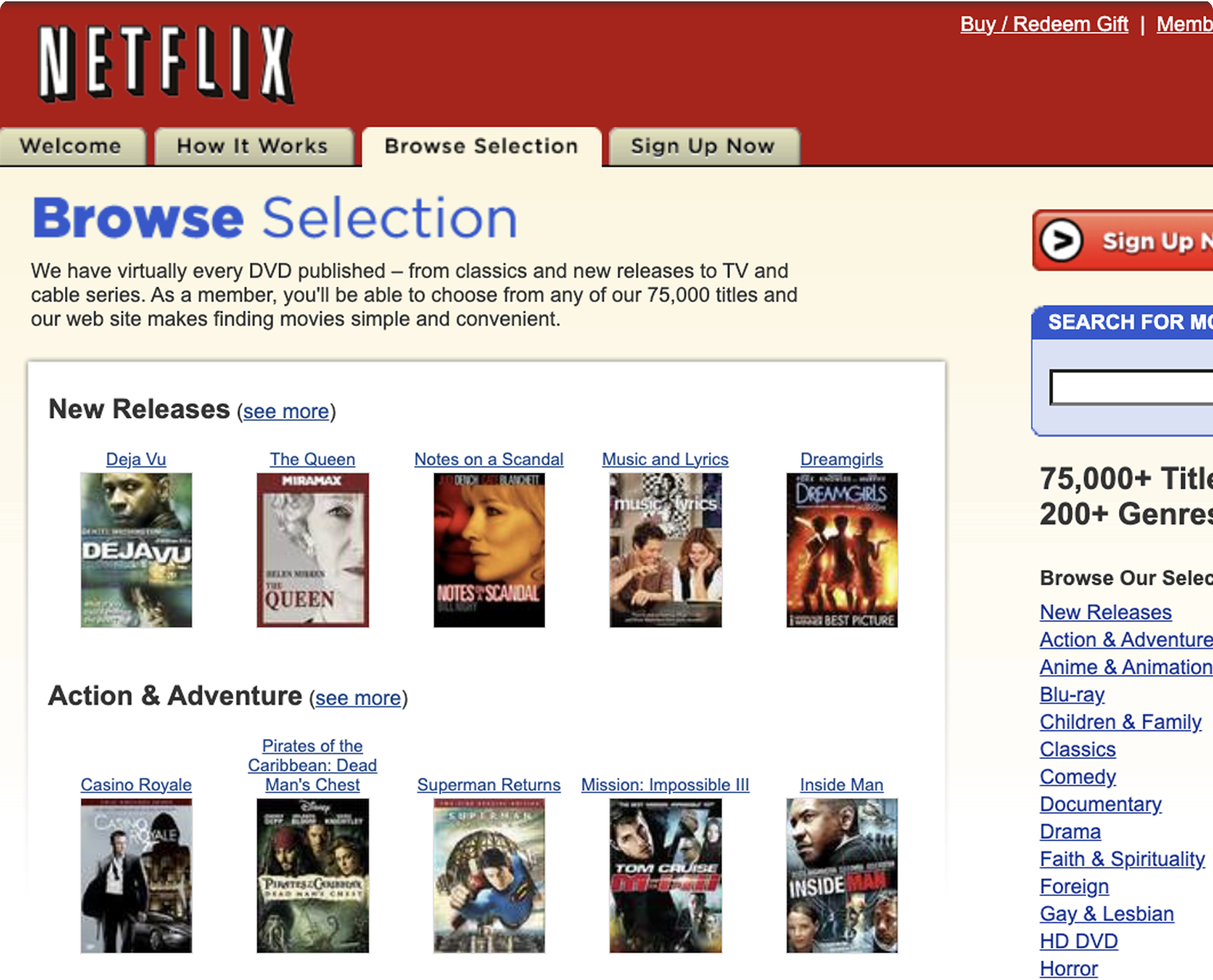
02 - Consistency
Buttons and interface elements lacked a unified design system.
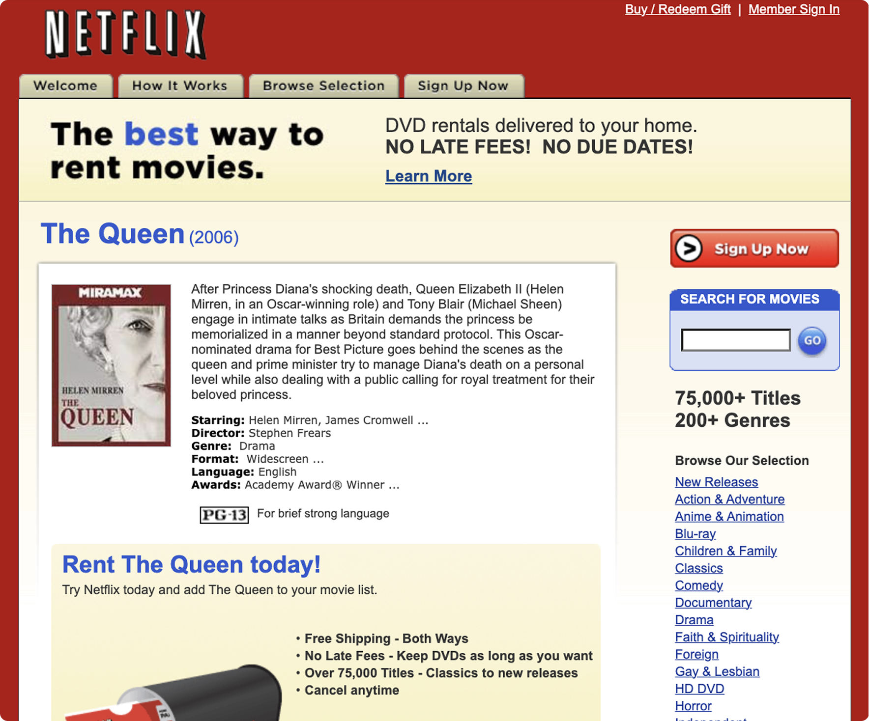
03 - Hierarchy
Crowded layouts and inconsistent typography made information difficult to scan.
Research & Benchmarking
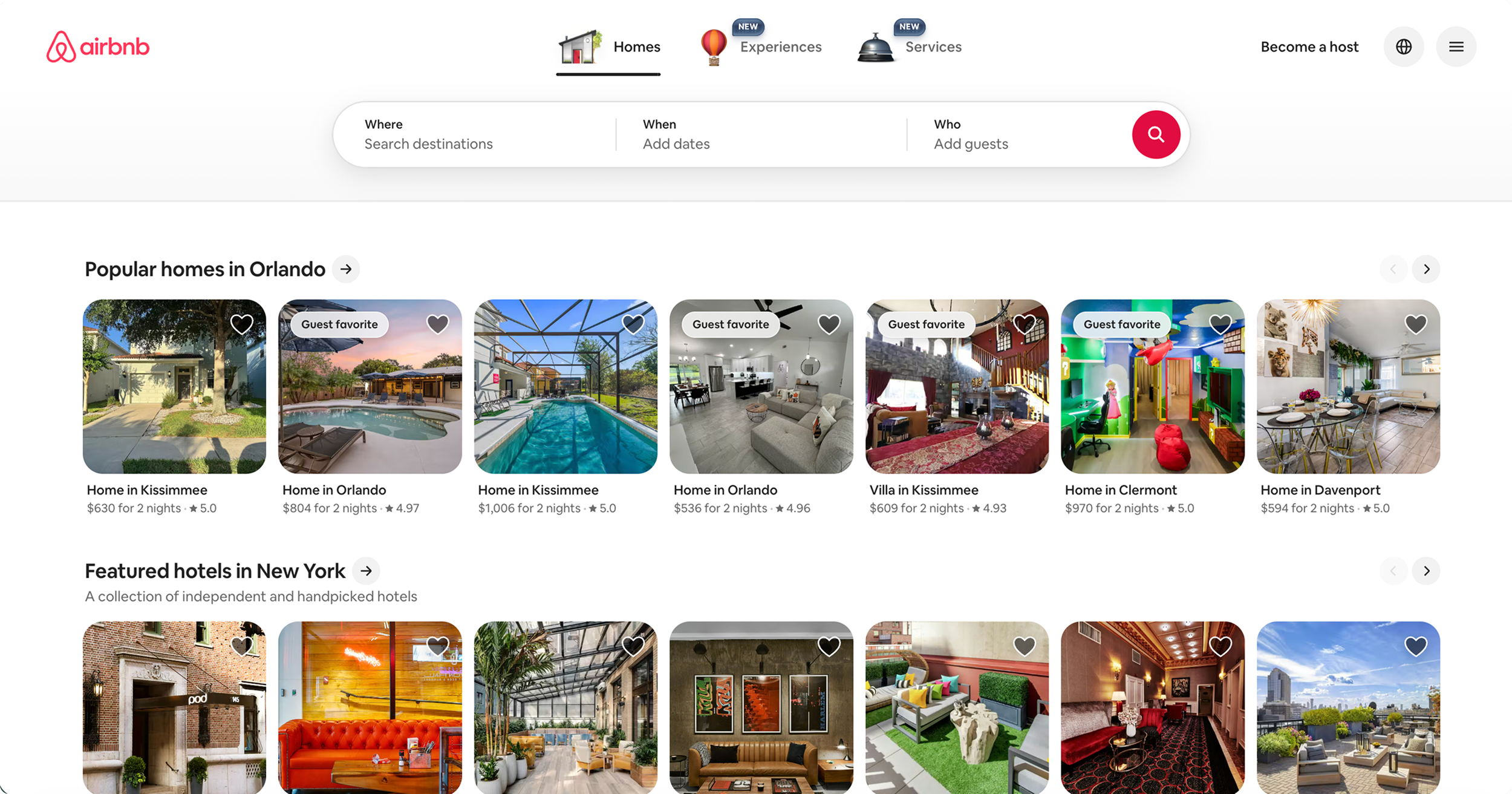
We looked at Disney+, Spotify, and Airbnb to understand how other platforms organize content and guide users through different tasks. We focused on navigation, visual hierarchy, and how design elements help users move through an interface.
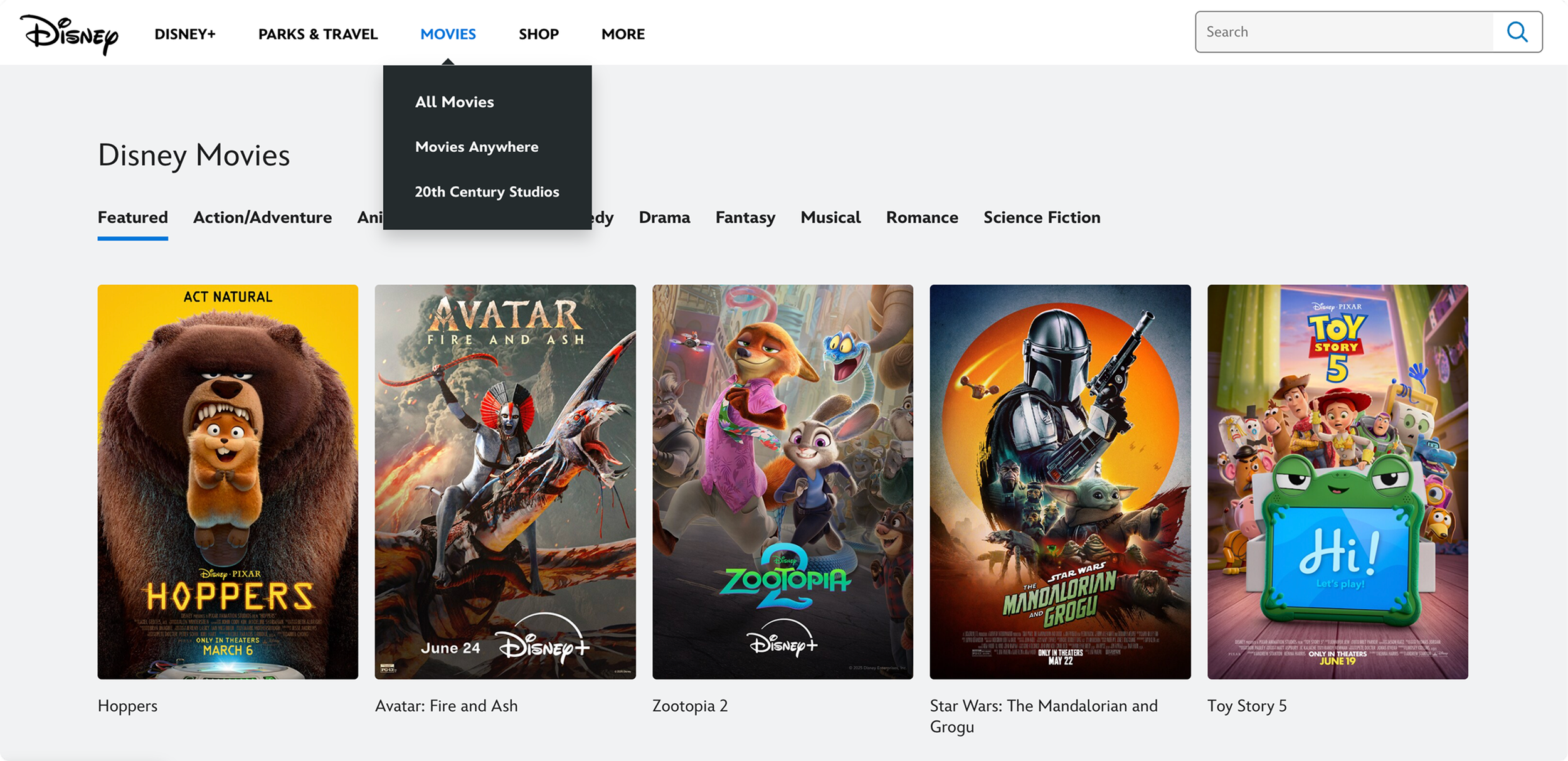
01 - Disney+
Clear navigation and organized content grids helped inform our approach to movie browsing.
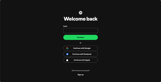
02 - Spotify
A focused sign-in experience showed us how strong visual hierarchy can make important actions easier to identify.
03 - Airbnb
Consistent card layouts and prominent buttons helped us think about organizing content and guiding users through checkout.
User Research
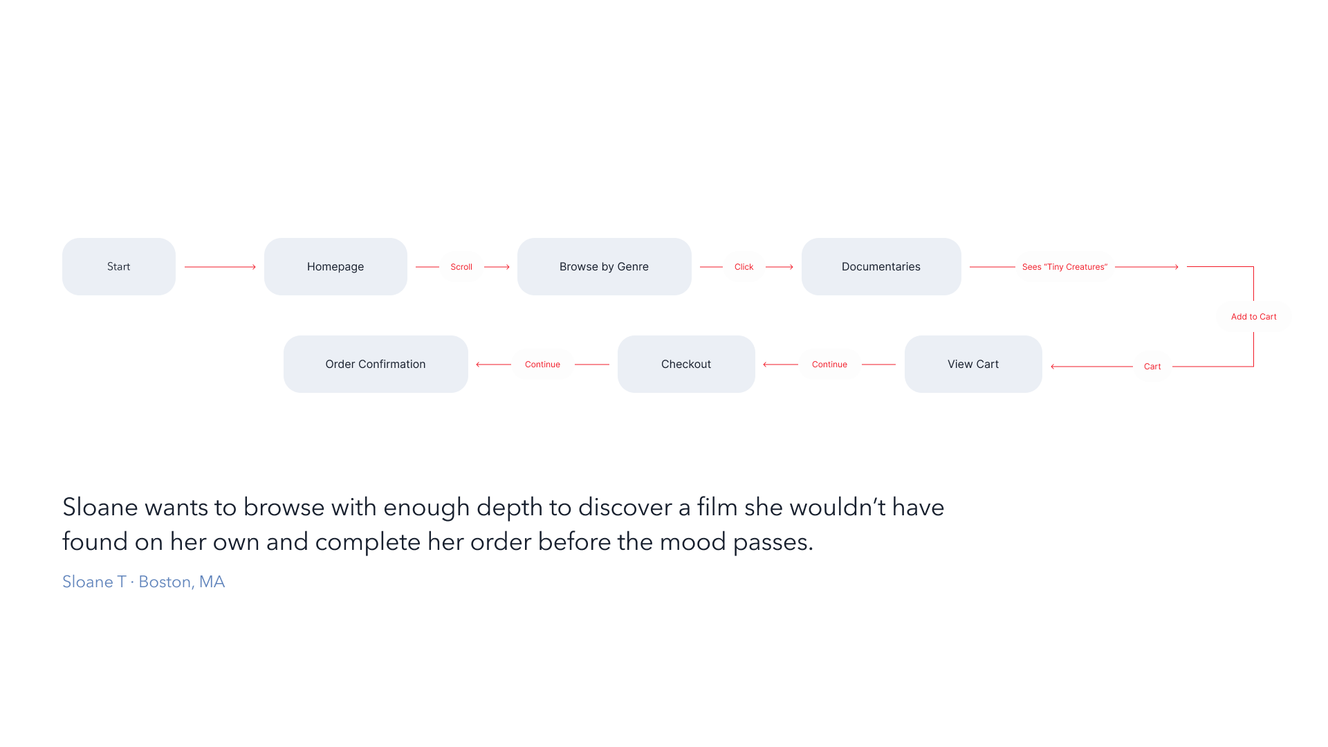
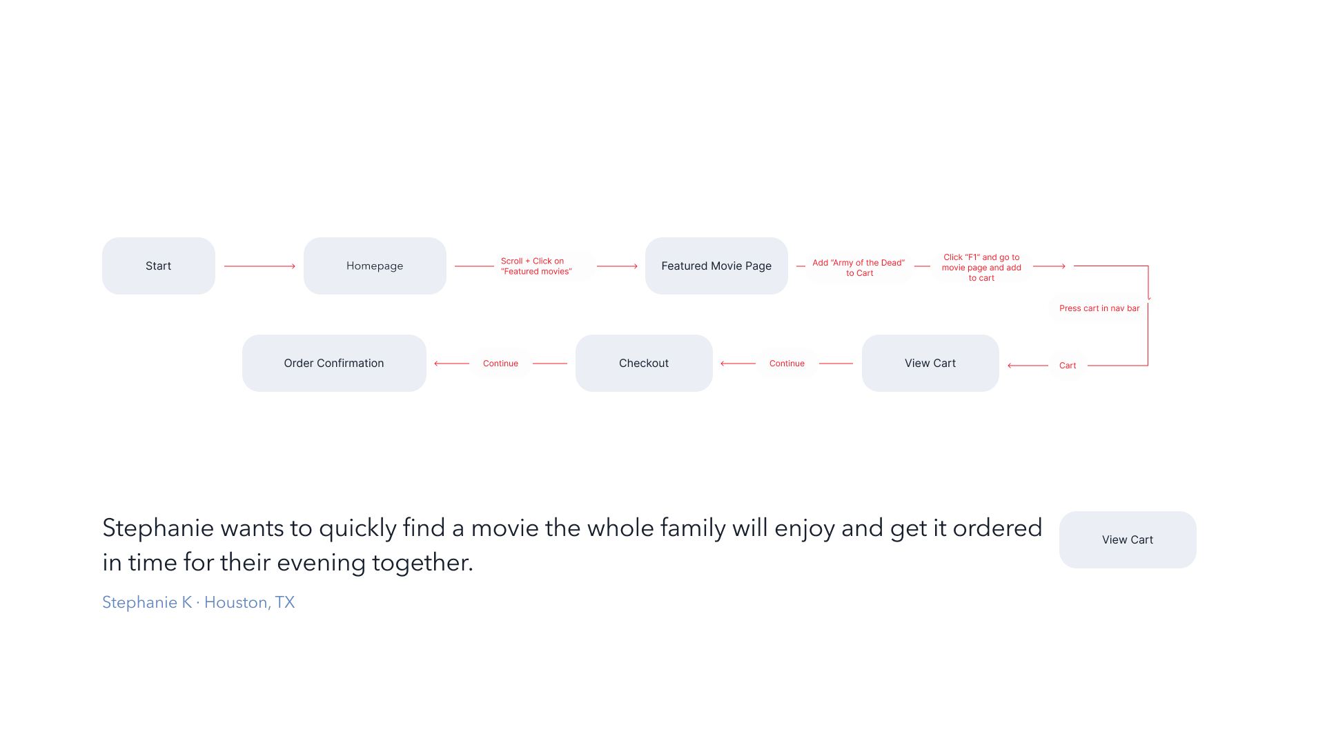
We created two user personas to explore different browsing habits and goals. By mapping out their task flows, we were able to better understand how users would navigate the website, discover movies, and complete an order.
User Personas
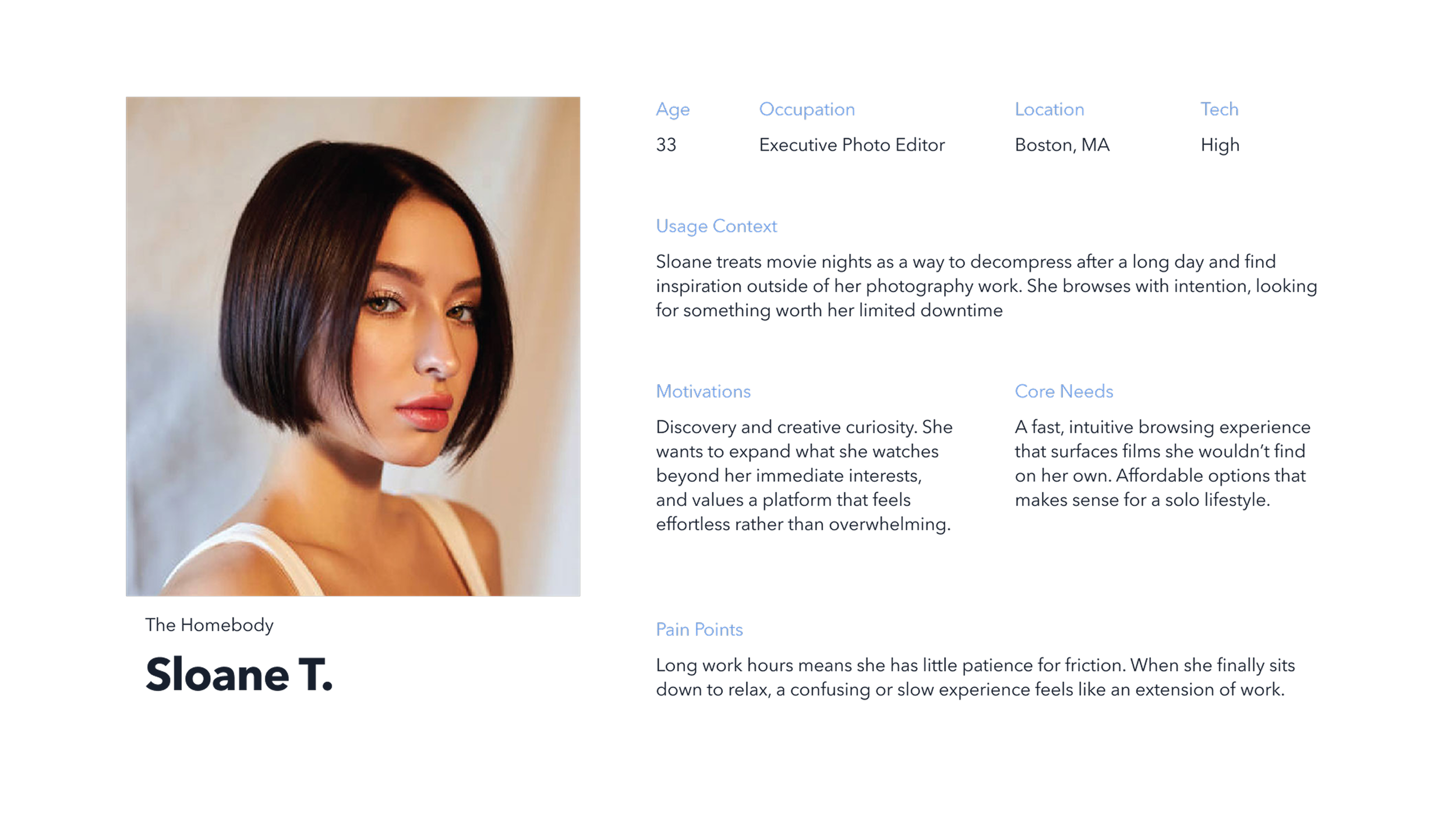
User 1: Sloane: The Homebody
Sloane enjoys discovering documentaries but doesn't want to spend too much time searching. She needs an organized browsing experience that makes finding and ordering a movie simple.
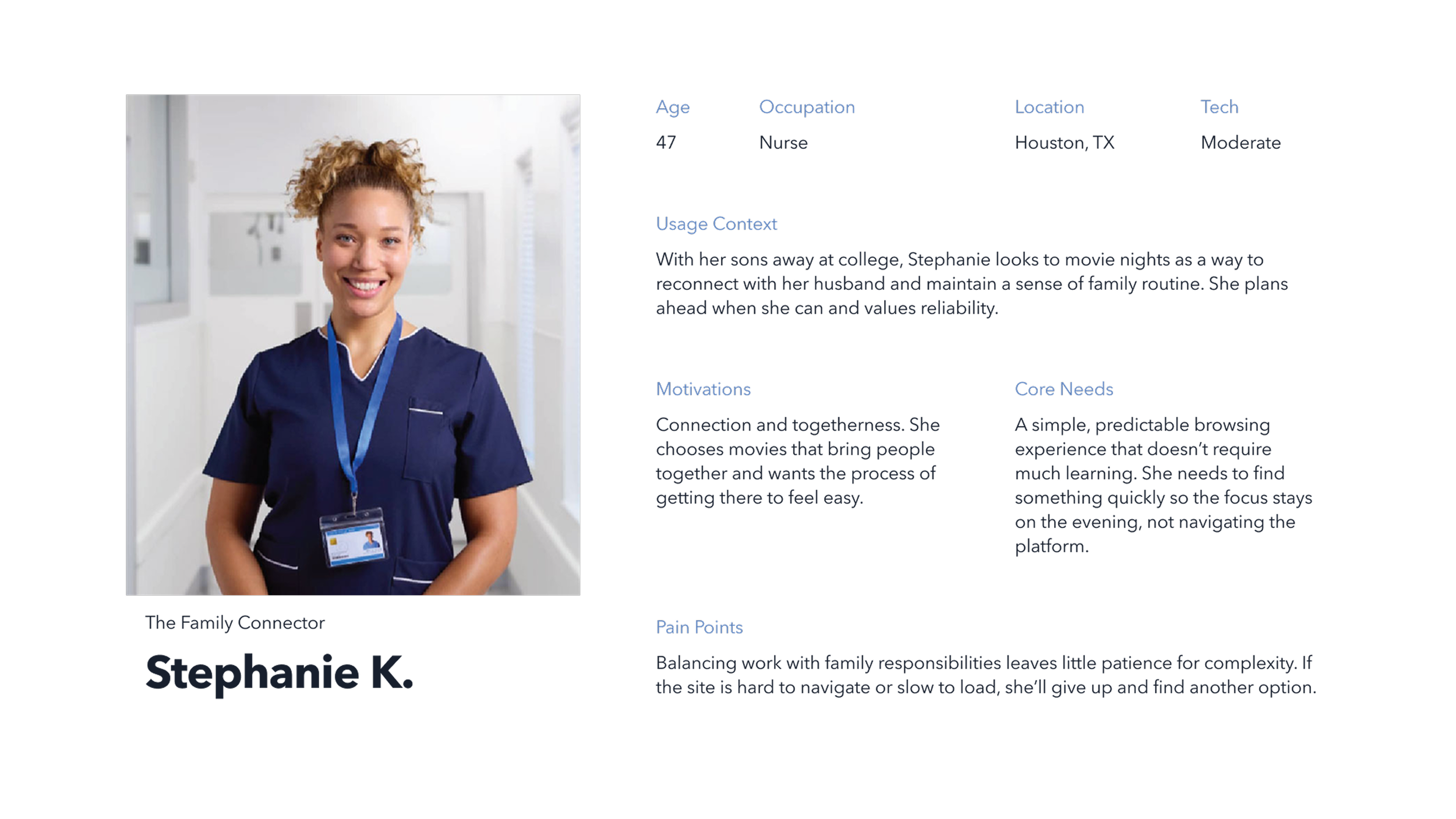
User 2: Stephanie: The Family Connector
Stephanie wants to quickly find movies to enjoy with her family. She values straightforward navigation and a checkout process that doesn't require too many steps.
Task Flows
Wireframing & Prototyping
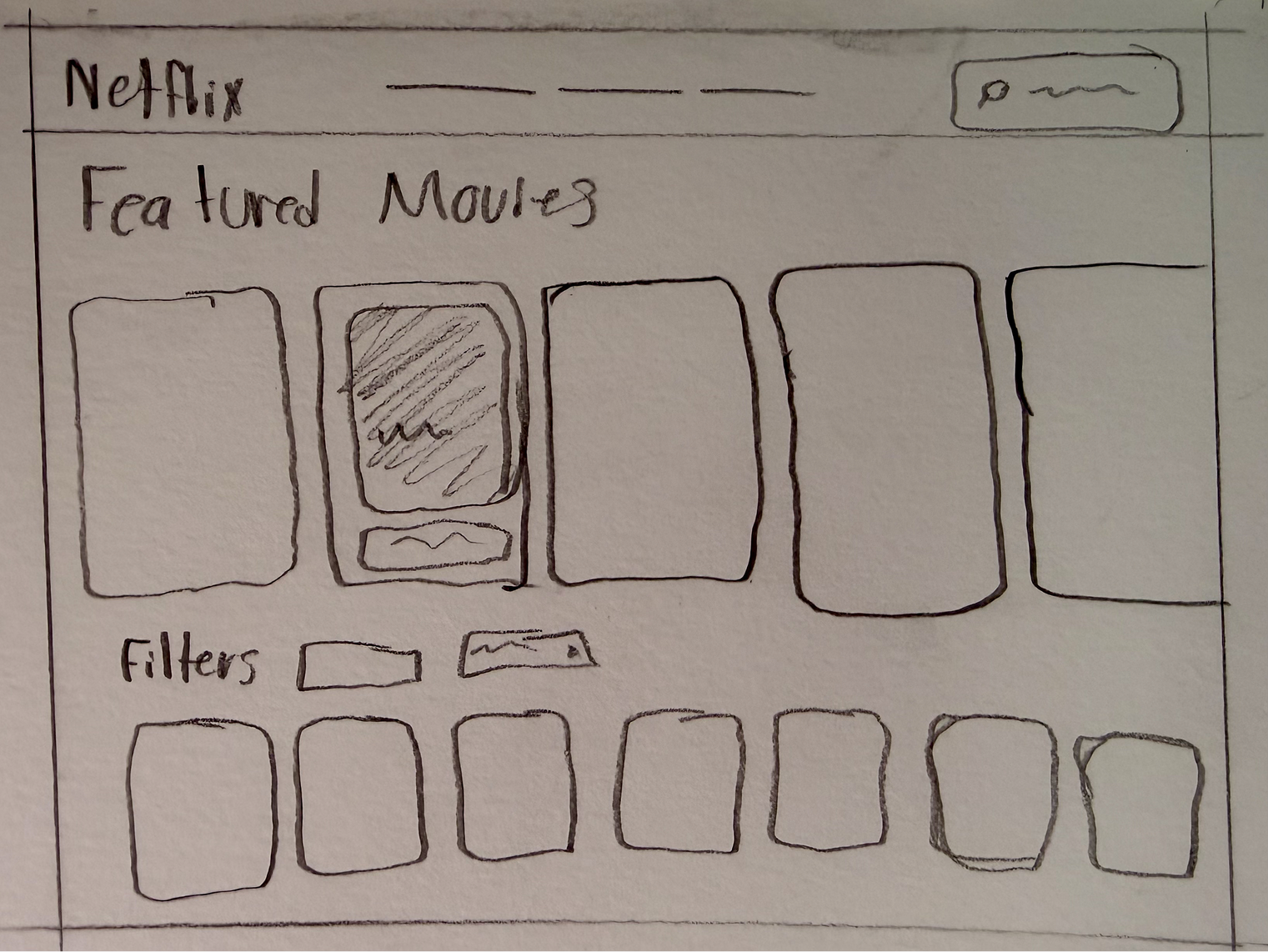
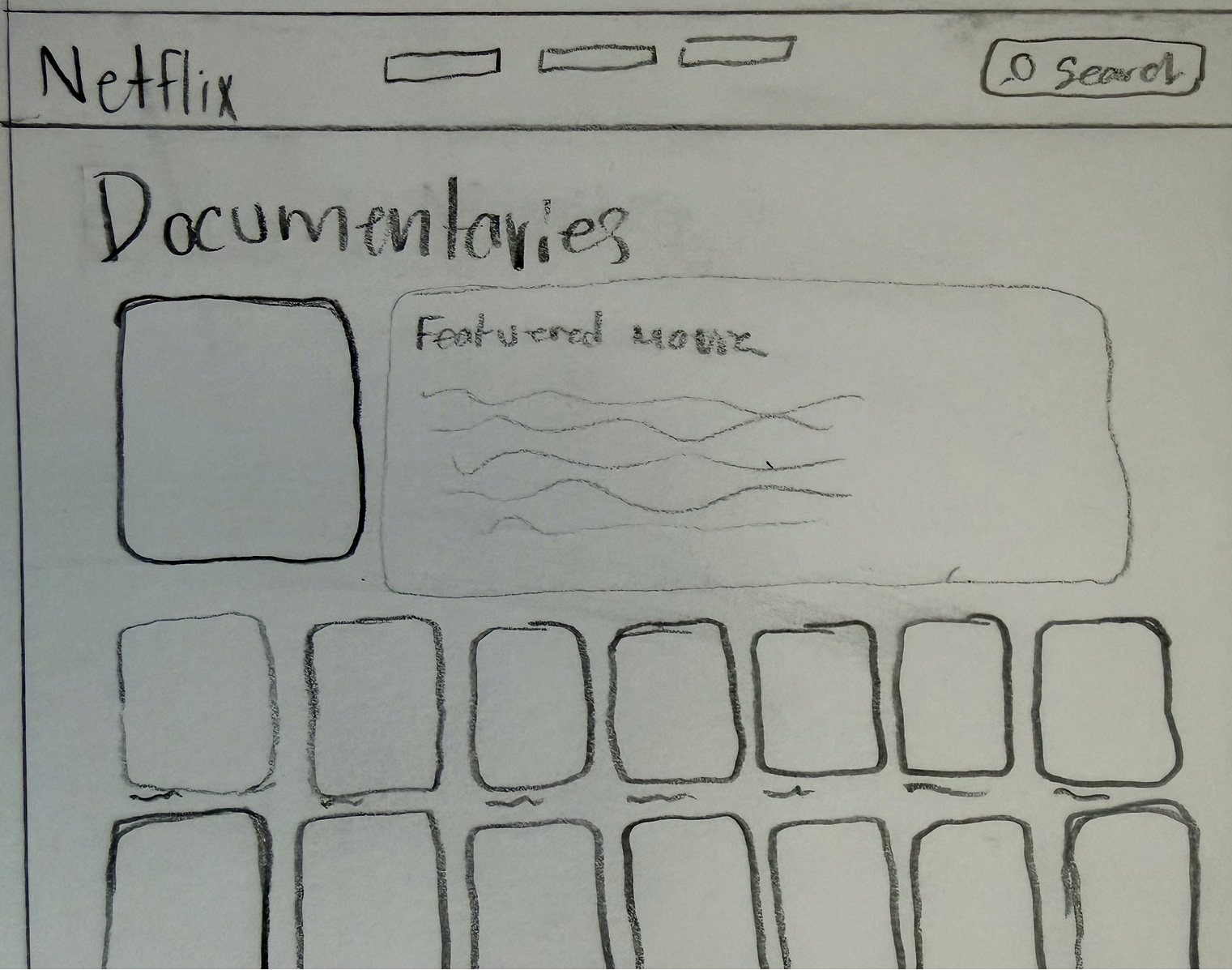
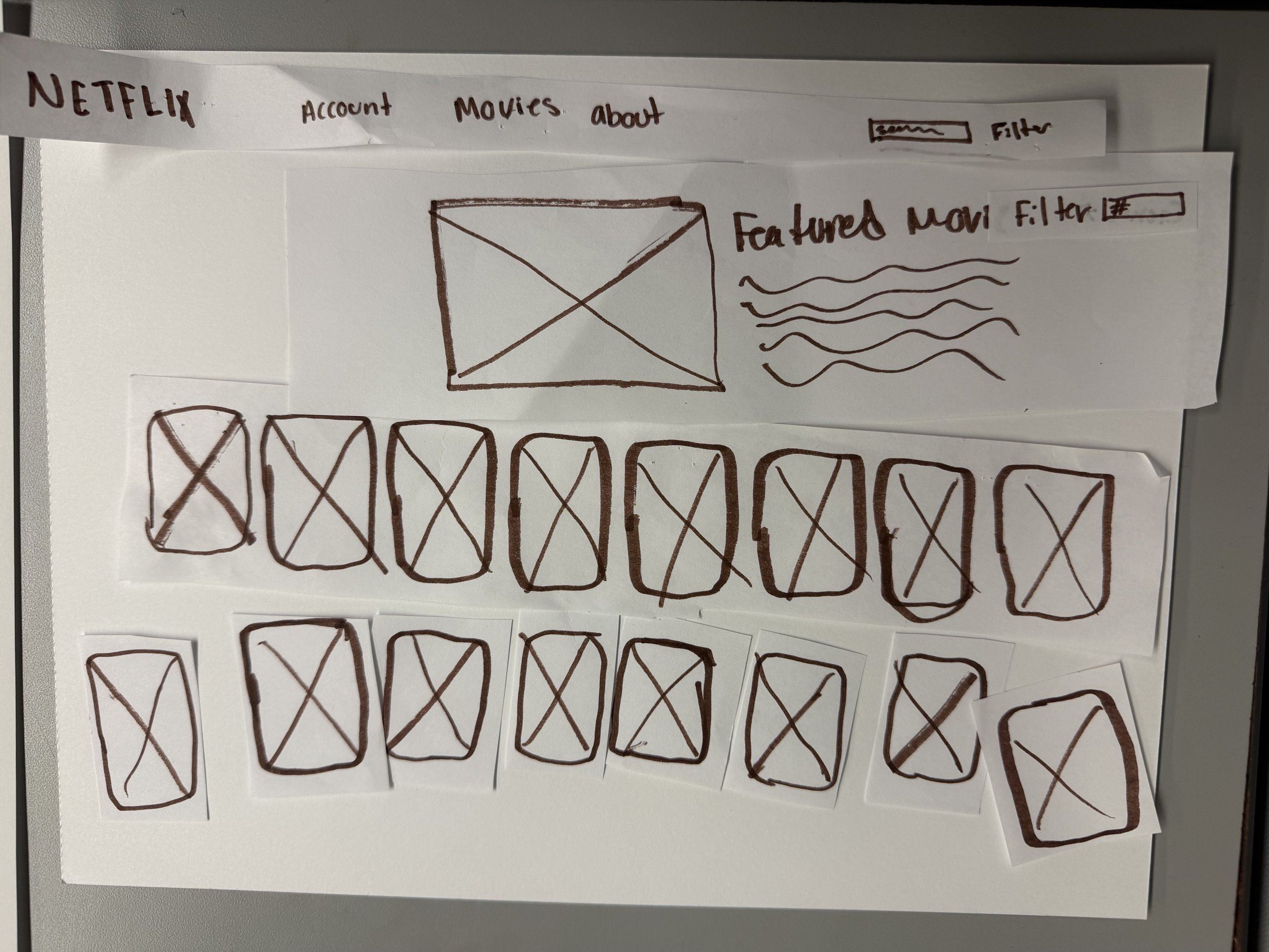
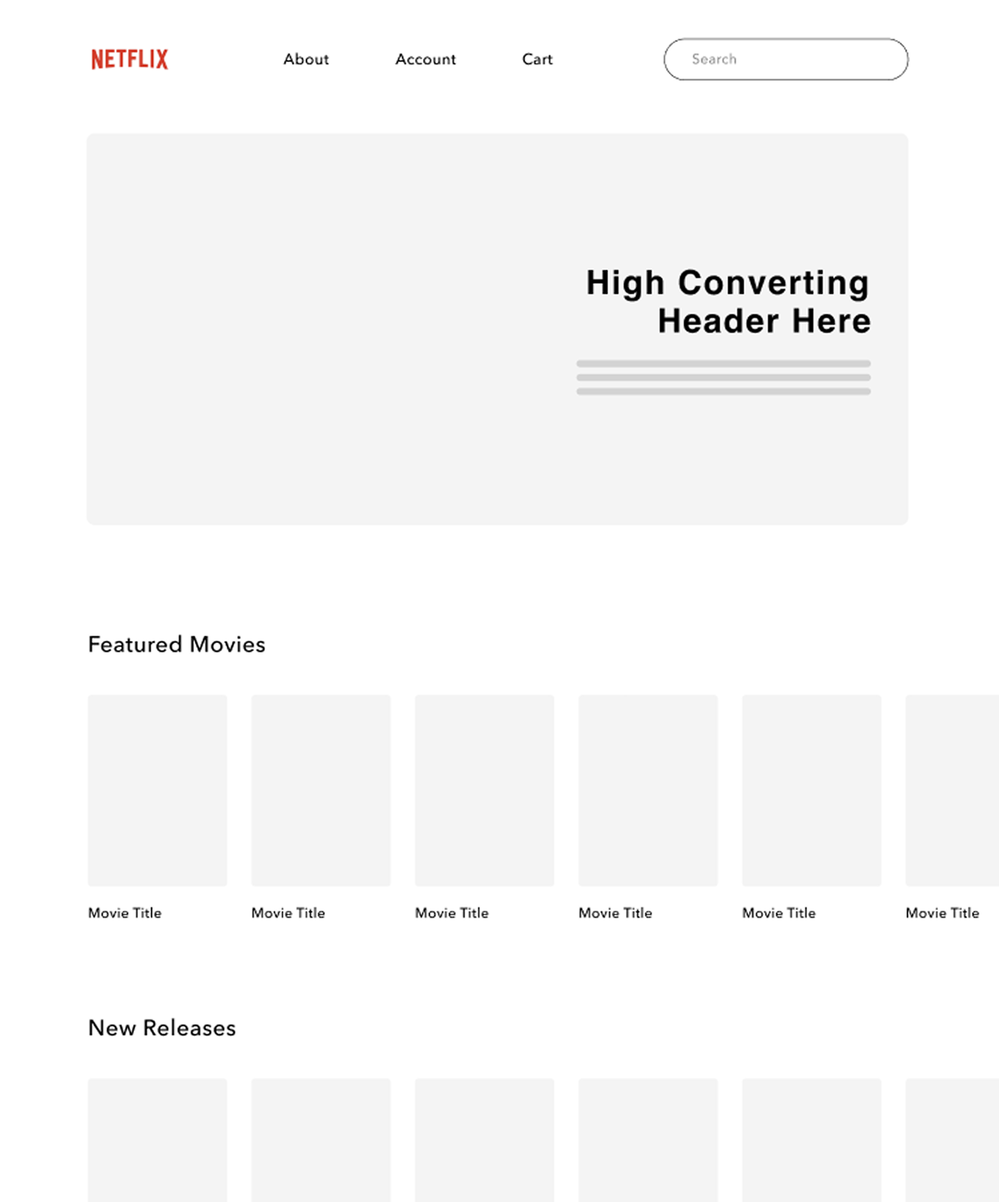
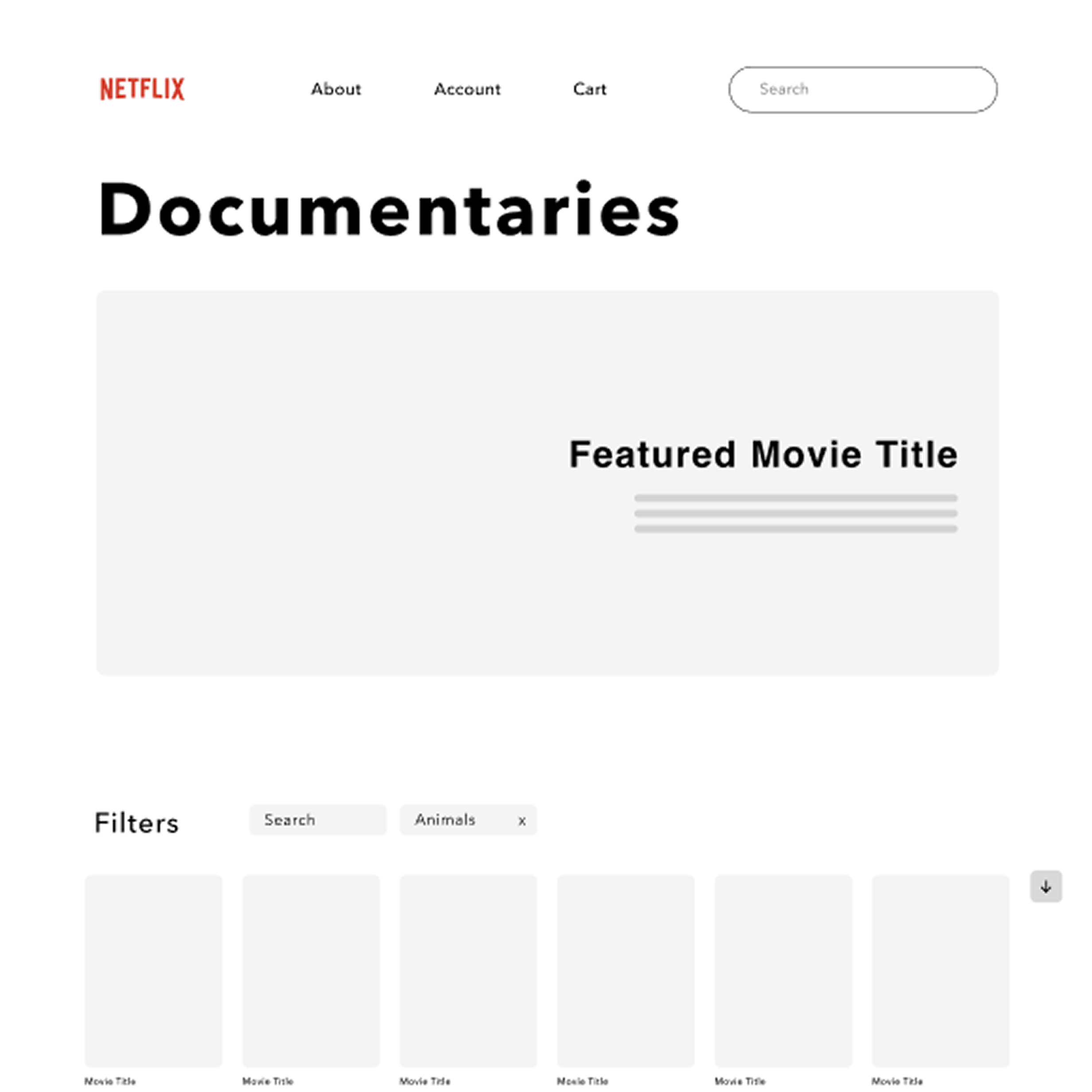
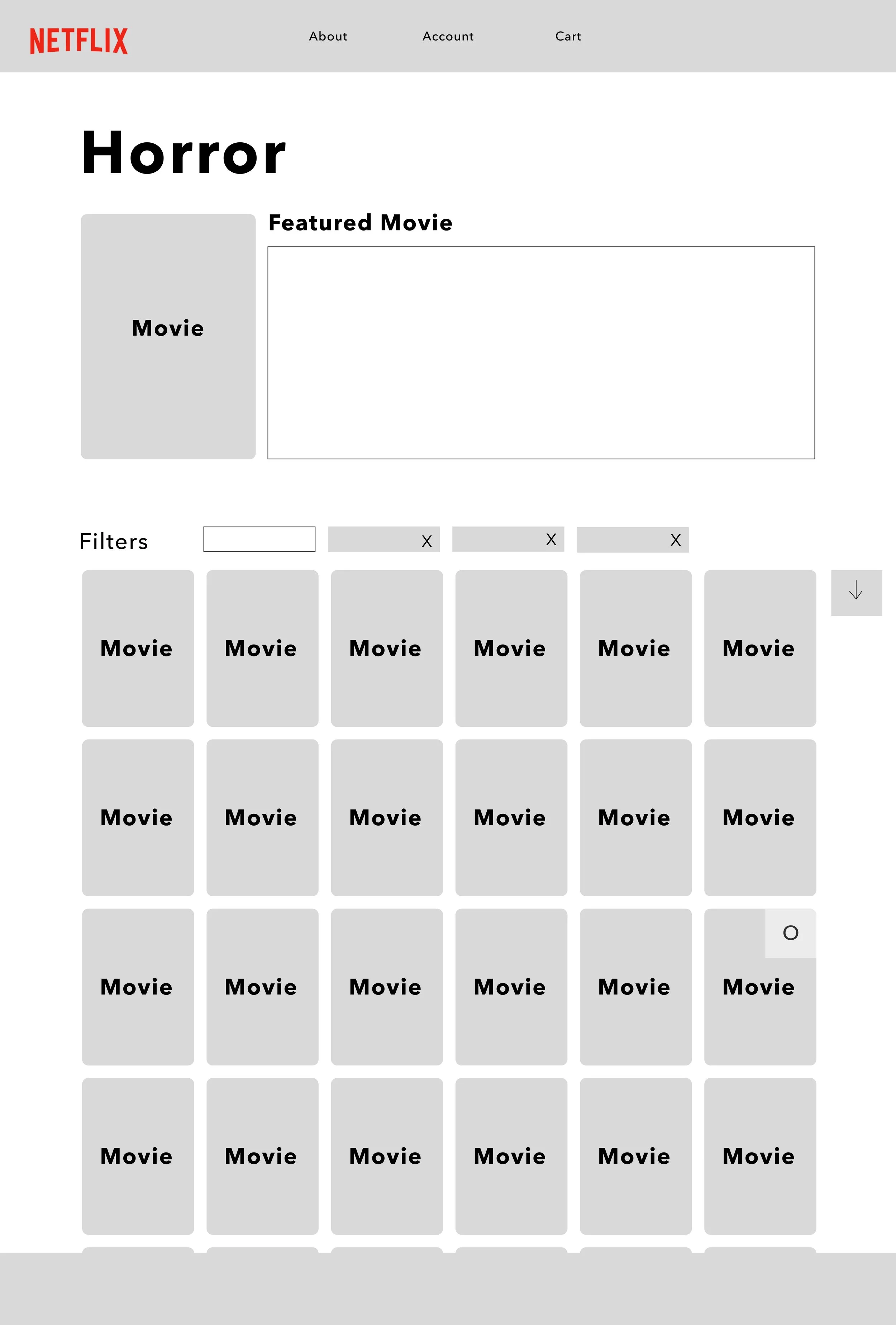
We started with sketches and paper prototypes to explore different layouts and organize the website's content. From there, we moved into Figma to develop wireframes, focusing on clearer navigation, consistent movie browsing layouts, and a more straightforward checkout experience.
Visual Exploration & Design System
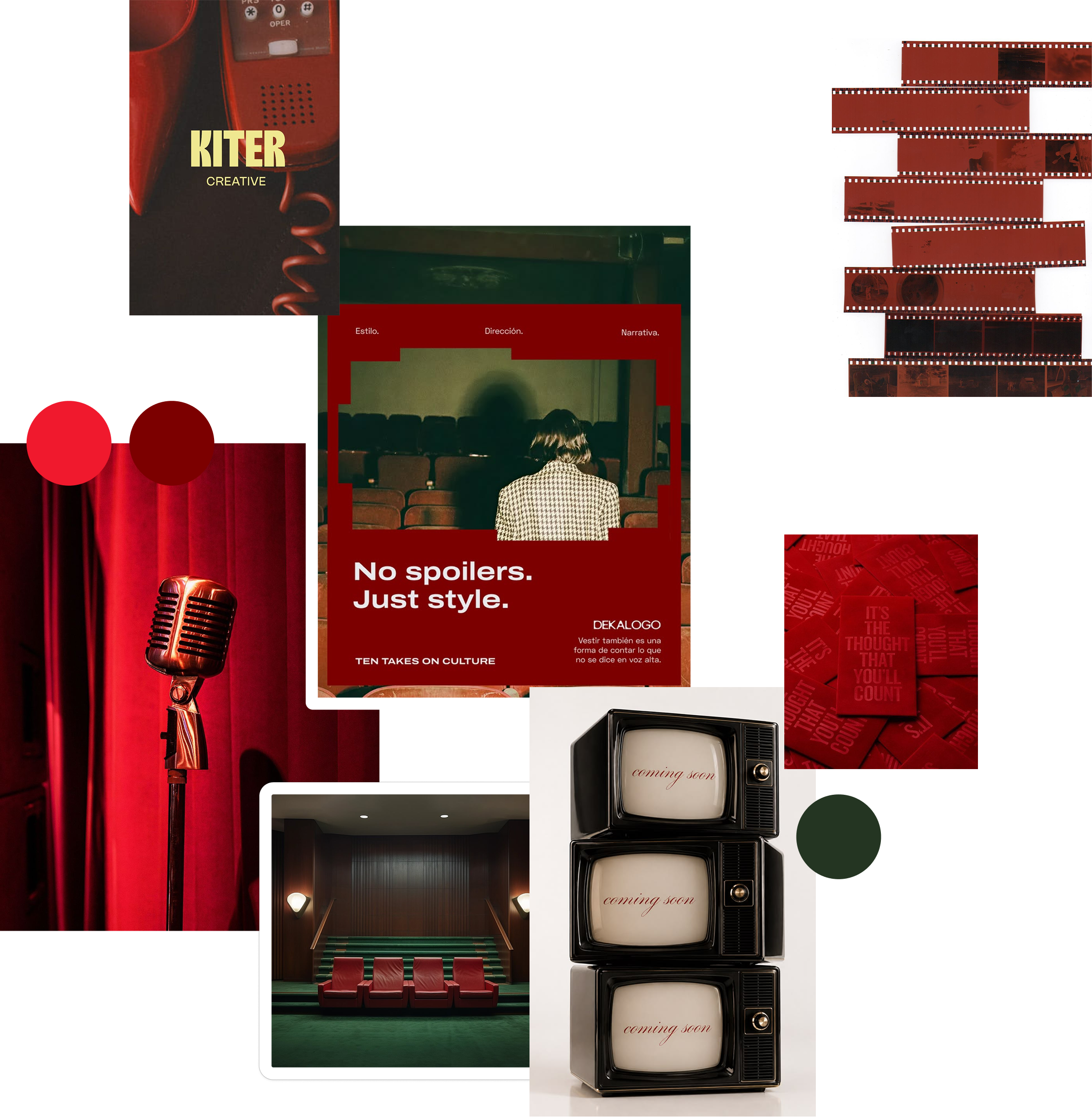
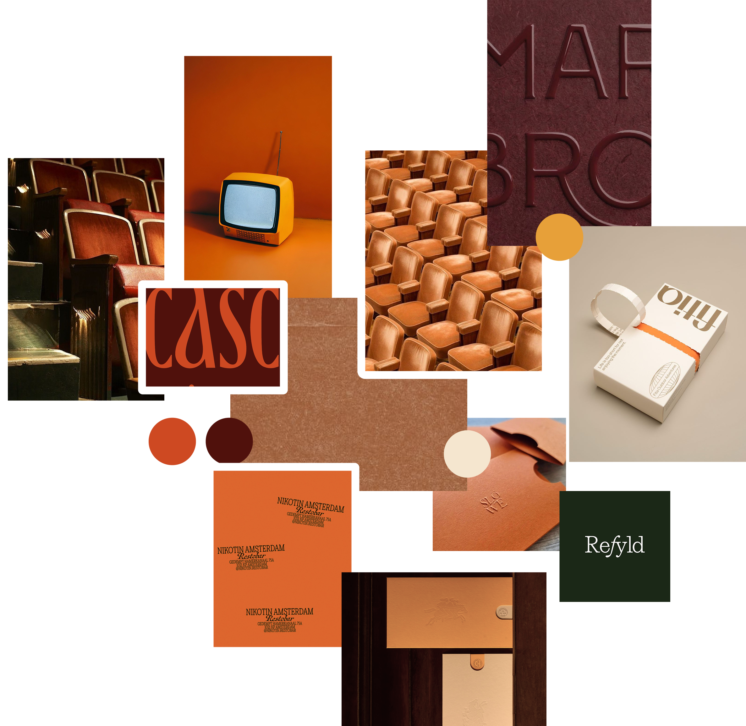
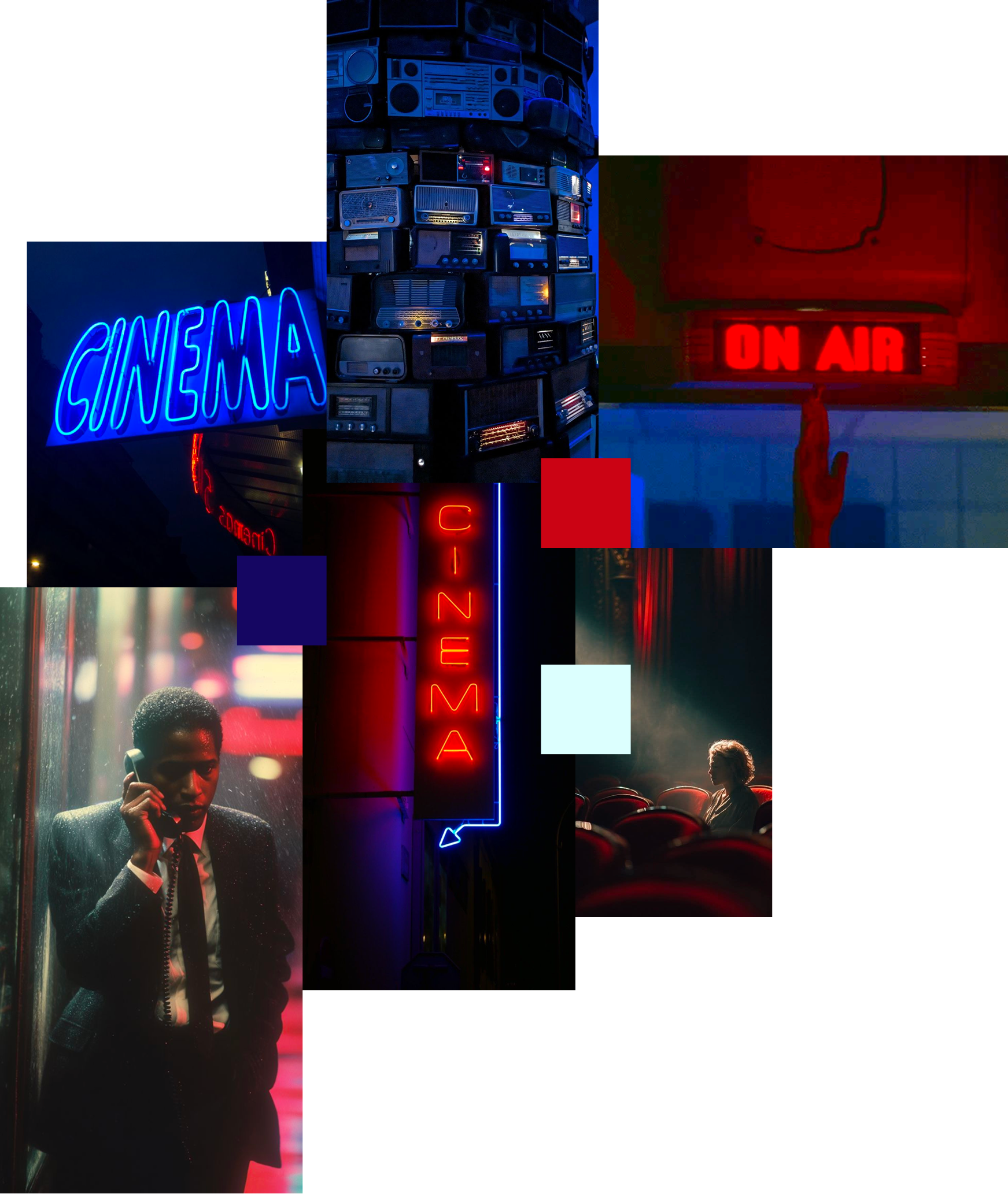
We explored different color palettes, typography, and interface styles to create a more cohesive Netflix experience. We tried light and dark themes but settled on a darker palette that allowed the movies to shine while keeping Netflix’s identity.
Exploration
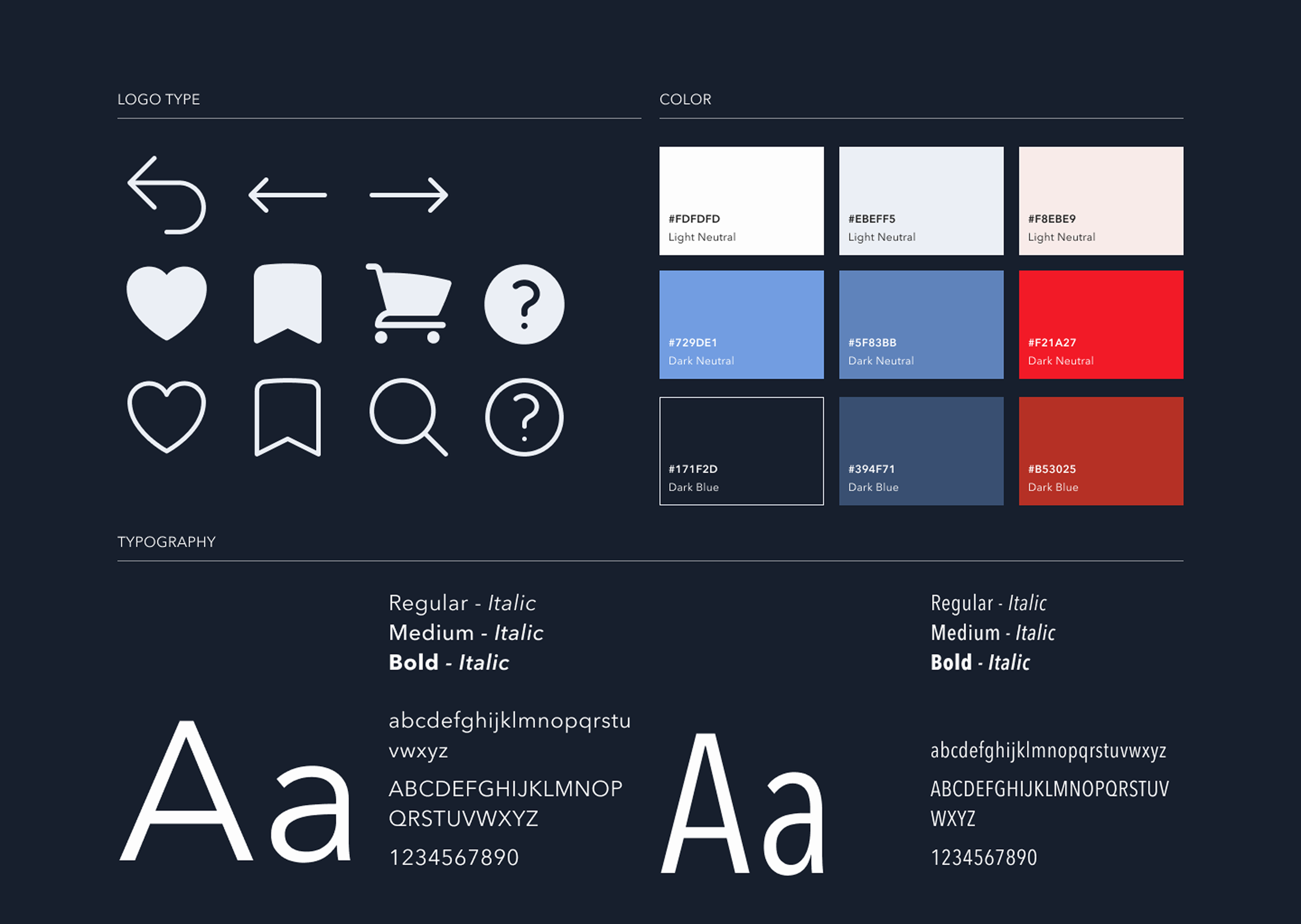
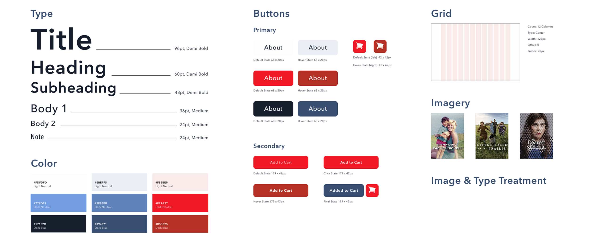
Style Guide
Final Design